White is a family, not a code value
Cotton, smoke, stone, sky and specular skin remain close but not identical. Small temperature and texture differences keep the white costume legible without an outline or artificial key.
Grade reconstruction report · 2022
Eight frames in which near-white costume, dense period interiors, mauve spectacle and enormous reconstructed spaces are made to coexist through value design, palette subtraction, protected texture and careful foreground-background integration.
Gangubai Kathiawadi often appears restrained because its average chroma is low. That description misses the force of the finish. White cloth is separated from cream walls, pale sky and specular skin by tiny value and temperature differences; black rooms are allowed to become almost absolute; and occasional red, green, cyan or mauve fields arrive with theatrical precision.
The grade is inseparable from production design, costume, makeup, lighting and VFX. Several frames contain backgrounds whose scale, atmosphere or period specificity make set extension or plate work plausible. This report identifies those signals and describes integration tests, but never turns plausibility into unsupported certainty. Its Resolve recipes are designed reconstructions from suitable source material, not claims about the original colourist's nodes.
The film-level construction
Cotton, smoke, stone, sky and specular skin remain close but not identical. Small temperature and texture differences keep the white costume legible without an outline or artificial key.
Most surfaces are pulled toward cream, olive, charcoal or blue-grey so that red, mauve, green and cyan can arrive as structured events. Low corpus chroma is active palette editing, not an absence of design.
Doorways, furniture, hair and unlit rooms become large graphic masses. Important detail is selectively returned; the whole toe is not opened merely because information exists in the negative.
Whether a space is wholly photographed or extended, haze, flare, black level, defocus, grain and colour spill make it feel continuous. A background can be technically perfect and still fail if it does not inhabit the same atmosphere.
Resolve blueprint
With camera originals, normalize into DaVinci Wide Gamut / Intermediate through Resolve Colour Management or a documented input CST. Keep image formation—exposure, contrast and palette—in clip nodes, use dedicated branches for skin and background integration, and render to the calibrated display only at the end. If only an SDR Rec.709 master exists, transform gamma 2.4 into the working space for consistency but do not expect recovered highlight latitude or robust keys.
Gangubai's decisive controls are value separation and subtraction. Build the white/black architecture first, then remove unwanted hue families, then preserve the few designed colours. Treat all numerical values below as test ranges on correctly normalized log/raw material.
Place camera originals and any plates in one documented scene-referred working space.
Set face, cloth and background relationships without erasing motivated warm, green or blue light.
Separate cotton, skin sheen, sky, smoke and practical cores near the top of the signal.
Use the toe as a compositional shape while retaining only the detail that matters.
Pull incidental colours toward cream, olive, charcoal or blue-grey so designed colour has authority.
Preserve skin texture and narrative makeup without forcing a universal beauty tone.
Direct attention with broad, motivated windows rather than global exposure compromise.
Make foreground and environment share edge behaviour, illumination, black point and depth.
Join bright sources and distant space through physically motivated contamination.
Keep cloth, skin, smoke, architecture and VFX elements in one textural world.
Render the working image to the calibrated delivery while preserving the designed white and black relationships.
8 reconstruction studies
Each study distinguishes the photographed foreground from the environmental or potentially composited background. Composite confidence labels refer only to visible plausibility in this one frame. They are not production credits.
The scopes test value occupancy, channel shape and chroma concentration for the selected midpoint. They cannot tell whether a colour came from paint, lamp spectrum, makeup, grading or compositing; that separation remains a visual and production-informed diagnosis.
01 · Dark room, divided colour · shot 13 · 01:04:33:02
A small girl on the bed carries the frame's red; green-black walls, a pale window and a warm reflected figure divide the surrounding darkness into distinct spaces.
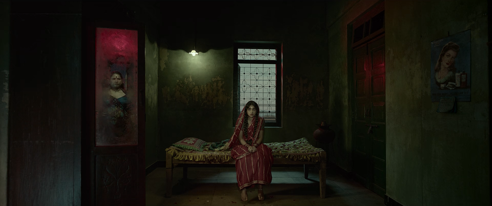
The mean key is only 4.4 L* and more than ninety-five percent of pixels fall in the shadow zone, yet the frame does not read as indiscriminate underexposure. The bed, wall, doorway or mirror, window and central body each possess a slightly different black. Red clothing, the pale opening and a left-side warm reflection are rationed points of orientation.
The grade respects the room's darkness rather than excavating it. What matters is not how much detail can be recovered but whether the child's silhouette, bed edge and the reflected/secondary figure remain spatially legible at viewing size.
Low-key set lighting, dark paint and a controlled red costume are foundational. Resolve can consolidate green-black architecture, lower nonessential zones and locally protect the girl and window. It cannot turn noisy, accidentally underexposed material into these clean large shapes.
The warm figure at left appears through or within a reflective/framed surface. Whether it is a practical reflection, another opening or a composited element cannot be established from this still. The reconstruction should first reproduce it physically if possible because matching reflection softness and contamination is difficult after the fact.
Can regular footage get there?
The value design is achievable from ordinary log/raw footage if the exposure was intentional and the sensor retained low-level colour. Lifting severely underexposed compressed footage and crushing it again will leave blotchy green/magenta shadows.
Composite and background read
Its warm colour and framed placement are distinct from the room, but softness and darkness are compatible with a reflection through glass. No decisive edge or grain mismatch is visible.
The still identifies ambiguity, not an effect. Inspect moving parallax, reflection response and focus breathing before making a stronger claim.
Shot-specific Resolve pass
Lower the room into a deep toe while keeping bed edge, green wall and central body at slightly different values.
Why: Spatial readability lives inside the lower few stops.
Watch: Do not pin every dark surface to code black.
Suppress stray chroma in the room while retaining a dark olive-green family and the red costume.
Why: A restricted palette makes the few colour cues legible.
Watch: Avoid turning shadow noise into a uniform chroma smear.
Track broad low-gain windows over the girl/bed and pale window; hold them above the toe without making either bright.
Why: The eye needs two anchors, not a globally opened room.
Watch: Window halos and moving face keys will be obvious against black.
If composited, match its black level, glass colour, defocus and reflected contrast before adding shared grain.
Why: A reflection should inherit the surface between it and the camera.
Watch: An opaque, full-contrast figure will read as a second room pasted into frame.
02 · Period machine in pale air · shot 102 · 01:14:25:12
Dense iron and smoke are silhouetted against pale green-sepia air, with a small sun flare at the boiler edge joining machine, atmosphere and ground.
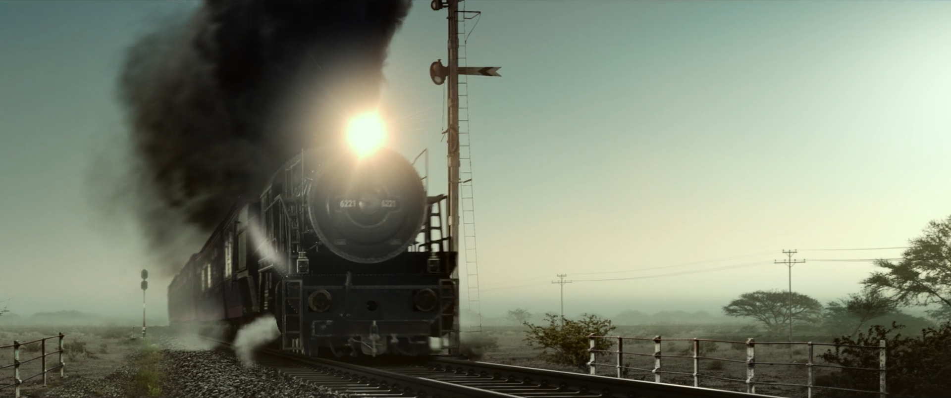
The locomotive is treated as one monumental dark shape, but its circular front, rail geometry and smoke remain internally separated. The landscape carries very little chroma and broad atmospheric compression; a small hot edge light at the boiler gives the black mass physical contact with the pale world.
The image avoids the common period-look shortcut of uniformly brown sepia. Ground, air and smoke occupy olive, cream, charcoal and slightly warm families. The resulting restraint gives scale to the smoke and keeps the machine from looking like a cutout.
Real or simulated steam, backlight and atmospheric depth must be designed in photography/VFX. Resolve can subtract modern greens/blues, shape the smoke toe and warm the flare, but it cannot make small, clean smoke into this enormous coherent volume or fix wrong perspective.
If the train or environment is composited, integration depends more on edge light, smoke transparency, shared haze and ground contact than on matching a single average colour.
Can regular footage get there?
A regular train shot can borrow the pale olive palette, but scale and period conviction require appropriate subject, smoke, lensing and air. Grade alone cannot create atmospheric perspective or a backlit steam volume.
Composite and background read
The period locomotive, smoke scale and controlled barren environment are all plausible candidates for augmentation. The frame is integrated well enough that there is no decisive matte seam; the inference comes from production demands, not a visible error.
A practical locomotive with photographed smoke and extensive on-set control could also explain the image. Credit-level certainty requires production sources or moving-plate inspection.
Shot-specific Resolve pass
Lower the machine and smoke while preserving the boiler rim, circular face and different smoke densities.
Why: Monumentality depends on a large black mass with internal form.
Watch: A hard toe will merge smoke, iron and rail into one silhouette.
Reduce landscape blue/green saturation and converge it gently toward pale olive and cream; leave the flare slightly warm.
Why: The period atmosphere is restrained, not simply sepia.
Watch: Do not turn every neutral into brown.
Match black point and softness by depth; add correct ground contact, edge contamination and shared grain before the look.
Why: Element integration must precede palette styling.
Watch: Smoke edges that are equally sharp at all depths reveal layering.
Reduce contrast and chroma progressively into the distant landscape while keeping the foreground rail stronger.
Why: Scale depends on aerial perspective.
Watch: Uniform fog over the locomotive will erase its designed black mass.
03 · Injury without chromatic spectacle · shot 281 · 01:32:31:07
Skin, background and white cloth are heavily restrained; blood, bruising, wet eyes and tiny speculars carry the colour and emotional detail.
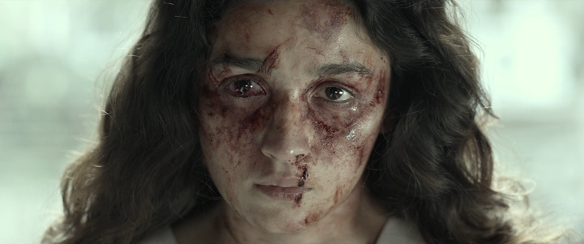
The close-up refuses lush beauty colour. Mean chroma is below 9 C* and skin sits close to the pale background, so distinction comes from pores, bruising, blood, wet speculars and subtle temperature shifts. The injury is legible precisely because the rest of the face is not made generically rosy.
The eye highlights and moist skin need a delicate shoulder. If the face is softened globally, the makeup boundary and emotional detail disappear; if microcontrast is pushed uniformly, bruises and pores become forensic and the pale background starts to look keyed.
Makeup design, lens choice, diffusion and a large soft source determine most of this image. The grade can subtract healthy redness, separate injury colour, shape eyes and retain cloth/background differences. It cannot create credible bruising from clean skin without dedicated beauty/VFX work.
The safest Resolve strategy gives skin and injury separate parallel branches. Do not use one broad skin qualifier to neutralize the very colour variation the story needs.
Can regular footage get there?
The tonal restraint is reproducible from a controlled close-up with suitable makeup, soft light and high-bit-depth capture. Without injury makeup, regular footage can match the palette but not the specificity of damage.
Composite and background read
The pale background and face share compatible softness and light direction. Makeup detail could be practical, digitally enhanced or both, but the still shows no decisive retouch seam.
Only moving, full-resolution material can reveal tracked beauty work, texture freezes or edge inconsistencies.
Shot-specific Resolve pass
Compress highlights gently so background, cloth, skin sheen and eye reflections occupy adjacent but distinct levels.
Why: The frame lives in subtle near-white relationships.
Watch: Recovered highlights must not turn grey.
Reduce generalized skin warmth on one broad branch; isolate blood/bruising with a second windowed key and preserve its hue density.
Why: The injury must remain specific while the face stays restrained.
Watch: Keys should not erase lips, eyelids or wet highlights.
Use very soft tracked windows for a small eye/cheek lift and an outside falloff around the frame.
Why: Attention belongs to expression, not to global facial brightness.
Watch: Do not create bright beauty patches that float over bruising.
Apply conservative denoise, then localized texture; unify any retouch with fine shared grain.
Why: Texture continuity makes practical and digital injury work credible.
Watch: Plastic skin next to sharp blood is an immediate giveaway.
04 · Monumental background · shot 331 · 01:37:12:06
A standing woman and seated man occupy a restrained warm foreground while dome, minarets and sky recede through low-contrast amber atmosphere.
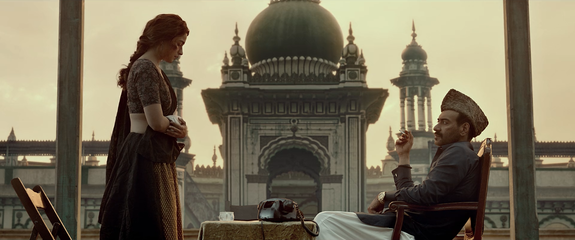
The frame sells scale through hierarchy rather than sharp detail. Foreground bodies carry the strongest contrast; distant architecture loses black density and chroma; the amber sky is broad and quiet. Almost the entire classified colour population is warm, but restrained mean chroma prevents the period world becoming orange fantasy.
The background's success depends on shared air. Fine architectural edges soften with distance, and the foreground does not appear outlined against the sky. Small warm spill and a compatible black point make the figures feel exposed to the same illumination.
A large set, location, projection, matte painting or set extension could provide the architecture. The still alone cannot distinguish them. Resolve's role is to harmonize plate and foreground values, impose depth-dependent contrast and keep skin/costume from becoming the same amber as sky and stone.
If this is an extension, the integration should be solved upstream at full quality. Colour-page windows can finesse depth and warmth but should not be used to conceal incorrect perspective, edge detail or light direction.
Can regular footage get there?
The warm restrained finish is transferable, but the scale and period specificity are not a grading achievement. Ordinary footage needs a compatible location or a professionally integrated environment; a LUT cannot supply the mosque, haze or perspective.
Composite and background read
The monumental architecture, controlled empty environment and period scale are characteristic reasons to extend a set. Integration is polished; no single edge proves it, so the confidence reflects production plausibility plus background construction, not a visible failure.
High plausibility is still not certainty. A sufficiently controlled location or full-scale set remains possible without external production evidence.
Shot-specific Resolve pass
Balance the figures for believable warm ambient light while protecting skin/white cloth separation.
Why: The background should be conformed to a trustworthy photographed foreground.
Watch: Do not let the amber sky dictate an excessive global warm balance.
Correct perspective/defocus upstream; then match plate black point, highlight softness, edge contamination and grain to the foreground.
Why: Colour matching cannot compensate for geometric mismatch.
Watch: Inspect hair, shoulder and ground-contact edges frame by frame.
Use depth-shaped contrast and saturation reduction across mosque planes; tint haze toward warm cream rather than orange.
Why: Distance should remove contrast and chroma progressively.
Watch: A uniform haze layer will flatten every architectural tier equally.
Suppress stray greens/blues and converge background families gently while pinning skin and costume neutrals.
Why: The image needs one warm atmosphere with material differences inside it.
Watch: Stone, sky, skin and cloth must not collapse to one hue/value.
05 · A city made from blue-grey depth · shot 391 · 01:44:02:15
A high wide view suppresses façades toward blue-grey, keeps roads and rooftops almost monochrome, and uses tiny practicals plus a low sun to articulate immense depth.
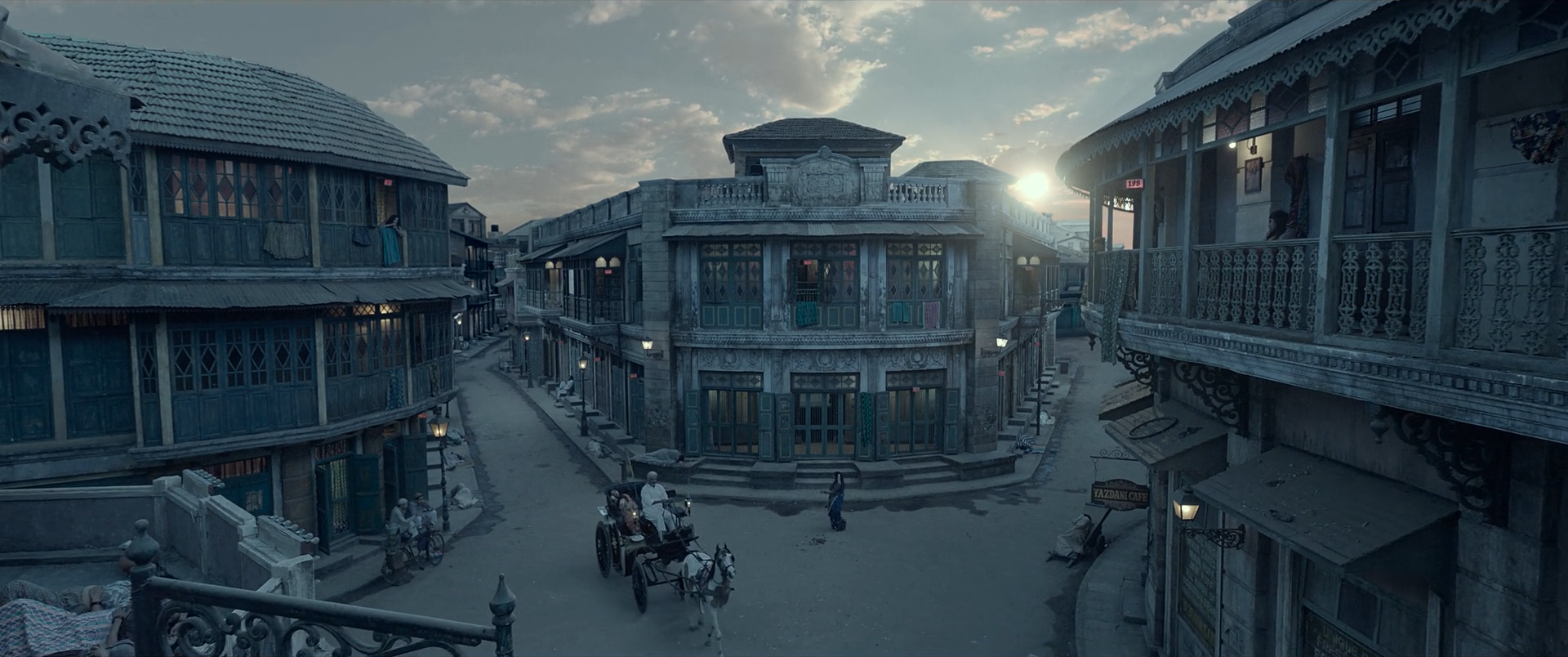
The frame's scale comes from repetition and subtraction. Hundreds of windows, signs and façades could fragment into colour noise; instead the district is consolidated into cool blue-grey layers. Tiny amber practicals and the sun provide measured interruptions. Warm balance is almost zero, yet those few warm pixels remain perceptually decisive.
Black levels become lighter and softer with distance, creating aerial perspective across the grid. The sun is not permitted to bleach the entire scene warm. This separation between local warm source and cool ambient city is more sophisticated than a global day-for-night or cyan wash.
The period district is very likely to involve a controlled set, extensive extension, cleanup or several of these. The grade can unify façades, deepen the near ground, cool ambient layers and retain warm practicals, but scale, period detail and correct atmospheric depth belong to production and VFX.
For a reconstruction, request mattes or depth passes if available. They allow contrast, chroma and haze to change continuously with distance; painting a few horizontal windows over a complex city will create depth discontinuities.
Can regular footage get there?
A city wide shot can adopt this cool/warm logic, but a regular contemporary location will not become this coherent period environment through colour alone. Extensive art direction, cleanup or environment work is the minimum.
Composite and background read
The elevated view, period continuity, enormous controlled district and repeated distant detail make extension/cleanup a likely production solution. The still is internally coherent and does not expose a single seam; the evidence is scale and controllability.
The image supports a strong reconstruction hypothesis, not a definitive account of which façades are practical, extended, replaced or fully synthetic.
Shot-specific Resolve pass
Match lens distortion, scale, defocus and grain; use depth mattes to organize foreground, middle distance and far city.
Why: The look depends on continuous spatial recession.
Watch: Hard depth bands will make the city resemble stacked cards.
Reduce incidental façade colours and converge them toward blue-grey/charcoal while pinning warm sources.
Why: Subtraction lets architecture read as one world at enormous scale.
Watch: Retain material and value variation between buildings.
Lift black point, lower contrast and reduce chroma progressively with distance; keep the near crossroads denser.
Why: Distance is communicated through loss of contrast as much as size.
Watch: Do not put uniform cyan fog over the nearest roofs.
Compress the sun softly and protect tiny amber lights from cool palette suppression.
Why: Small warm values articulate the cool city.
Watch: Orange dots without matching glow or spill look digitally painted.
06 · White as character · shot 504 · 01:52:38:18
A white-clad figure sits against an olive-neutral room and dark carved chair; restrained warmth and carefully preserved weave keep the portrait tactile rather than pristine.
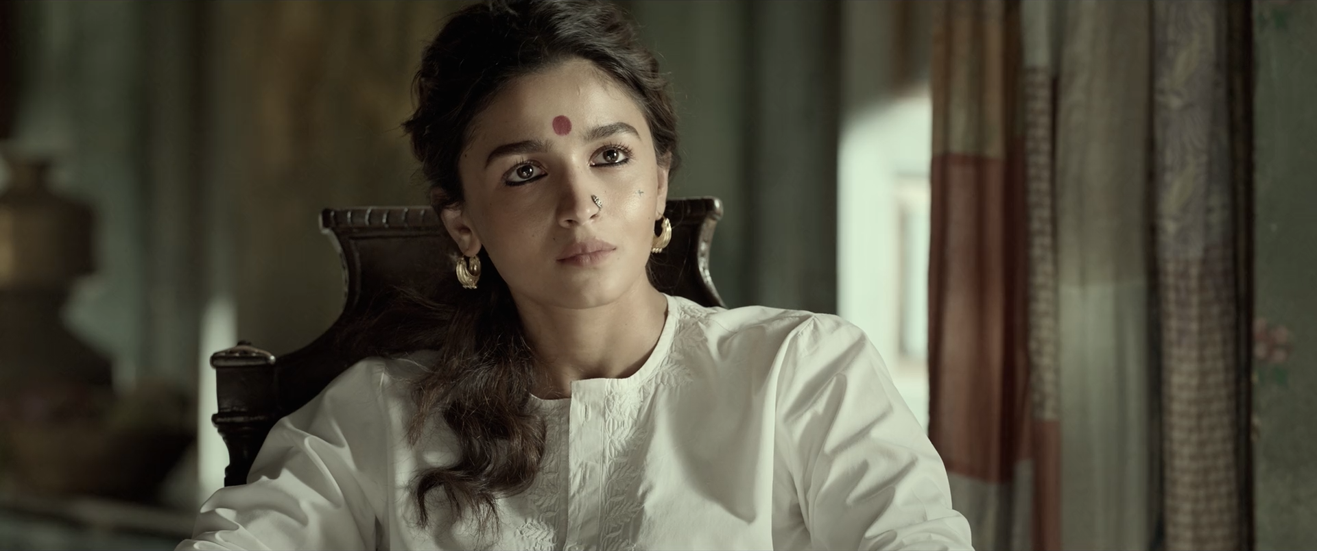
This portrait demonstrates the film's white hierarchy at human scale. Cloth is not neutral code white: folds move between cream, grey and warm reflected colour. Skin is warmer but only modestly more chromatic. The chair's carved black shape creates graphic contrast while retaining just enough edge detail to read as wood.
Nothing depends on a dramatic hue split. The sophistication is in small separations—forehead sheen from cotton highlight, cheek warmth from cream folds, chair texture from black background. Excess saturation, aggressive beauty smoothing or a hard shoulder would destroy it quickly.
White cotton, controlled warm-neutral key light, makeup and dark production design give the colourist a clean value structure. Resolve can finesse cloth temperature, protect skin, subtract wall colour and deepen the chair. It cannot restore clipped fabric weave or create flattering multidirectional light from a hard flat source.
The lack of obvious VFX is useful: it shows that the broader aesthetic is not dependent on spectacle. The same disciplined white/black palette can be recreated on an ordinary set if capture and styling are deliberate.
Can regular footage get there?
This is highly transferable to regular raw/log portrait footage with real white fabric, a dark background and controlled soft light. The difficulty is restraint and monitoring, not exotic tools.
Composite and background read
Light direction, chair edges, skin texture and room depth form one coherent photographed portrait. Standard cleanup may exist, but no environment replacement is needed to explain the image.
The conclusion is limited to visible integration; it does not rule out beauty work or object cleanup.
Shot-specific Resolve pass
Set Offset and temperature so cotton remains cream-neutral under the intended light, then place skin relative to it.
Why: The cloth is the portrait's reference family, not an instruction to zero every RGB channel.
Watch: Do not chase a numerical neutral if the source is intentionally warm.
Use a layered shoulder to separate cloth folds, forehead speculars and the brightest background details.
Why: Near-white materials need texture and value hierarchy.
Watch: A broad highlight recovery move can make the face dull grey.
Lower the dark furniture and room edges while returning only the carved highlights necessary for shape.
Why: The chair should frame the portrait without becoming an empty black cutout.
Watch: Keep hair and chair from merging at the head edge.
Track a soft face branch for tiny warmth and texture adjustments; leave reflected room colour in the shadows.
Why: Integration is more valuable than textbook skin neutrality.
Watch: Avoid waxy denoise and bright face-window halos.
07 · Mauve theatre · shot 988 · 02:34:57:12
Symmetry, costume and theatrical lighting produce three depth-coded colour groups: cream-white centre, mauve stage, and cyan-blue auditorium.
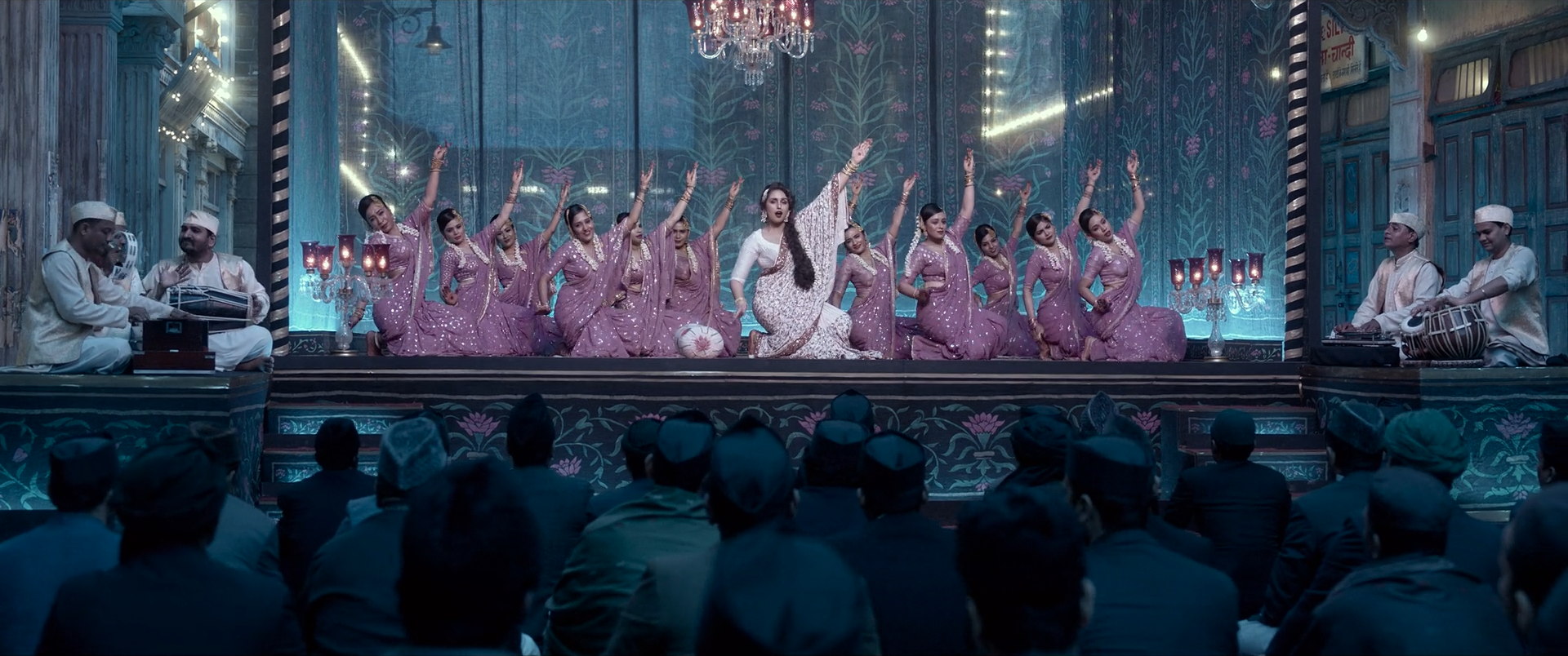
The colour separation maps directly onto staging. The lead's cream-white costume sits at the axis; chorus and proscenium belong to mauve; the audience recedes into cyan-blue. These are not arbitrary secondary corrections but large, spatially coherent production-light fields that also encode depth and hierarchy.
Despite a modest mean key and over half the frame in shadow, saturation remains perceptually strong because chroma is concentrated in broad designed regions. Opening the audience or globally warming skin would blur the stage/auditorium boundary.
Costume, set, gels/LED programming and exposure create most of the three-zone palette. Resolve can converge mauves, cool the auditorium, protect the white lead and balance skin within each lighting field. It cannot cleanly split a uniformly white-lit ensemble into these groups without rotoscoping every performer.
The reconstruction should be planned with lighting and art departments. Record lighting cues and, if possible, capture clean plates or group mattes; the colourist's role is consolidation and hierarchy, not wholesale recolouring.
Can regular footage get there?
The look is achievable on a regular stage only if costume and lighting already define the mauve/cyan/cream groups. Neutral coverage cannot be converted convincingly by a few global nodes.
Composite and background read
Light falloff and performer edges are coherent across the stage. Set extension or crowd work may exist, but the still does not expose a background seam; the colour divisions follow plausible lighting zones.
Moving crowd repetitions, edge behaviour and camera motion would be needed to assess augmentation confidently.
Shot-specific Resolve pass
Compress the lead costume shoulder while retaining folds and a slight cream bias; keep it brighter than mauve performers without clipping.
Why: The central white value establishes hierarchy before hue.
Watch: Do not desaturate the lead to sterile blue-white.
Gather pink/purple costume and set variants into a broad mauve family while suppressing isolated unrelated colours.
Why: A coherent stage field supports the composition's symmetry.
Watch: Pin faces and red details before the warp.
Use large architectural windows to keep the audience denser/cooler and the central stage slightly more open.
Why: Depth comes from value and hue together.
Watch: Avoid a visible rectangular boundary at the proscenium.
Protect face luminance within each zone but retain mauve or cyan spill rather than neutralizing every performer.
Why: Shared source colour makes the ensemble belong to its light field.
Watch: Many small face keys will chatter and flatten crowd depth.
08 · High-key scale · shot 1375 · 03:10:06:12
Tent fabric, clothing, pale daylight and specular peaks occupy most of the upper range, while red-black floor geometry and small dark faces prevent the rally from dissolving into blank brightness.
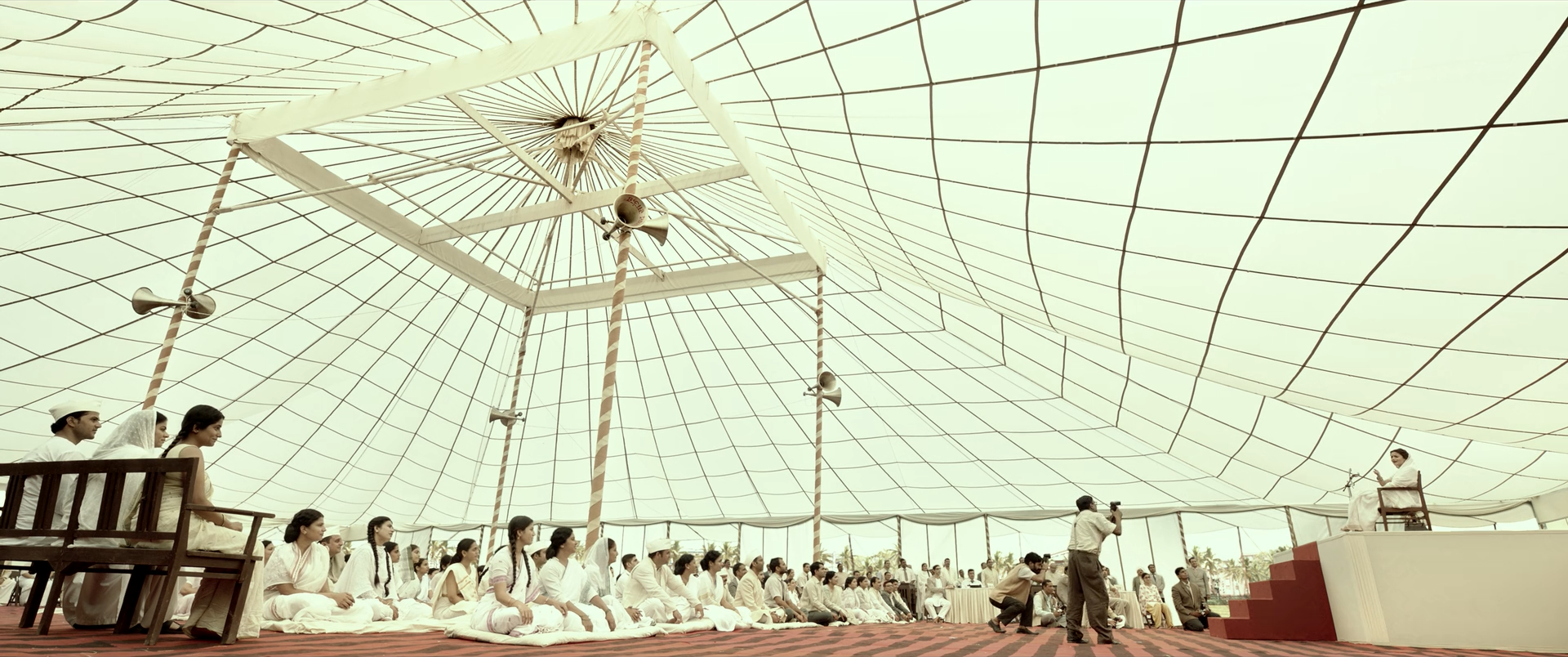
This frame inverts the film's black-room strategy: eighty-six percent of pixels fall in the highlight zone. The challenge is not recovery of one bright object but differentiation of thousands of near-white objects. Canopy ribs, folds, clothing, faces and open light remain legible through small value, texture and temperature shifts.
Red and black geometry at the bottom is essential. It gives the eye an anchor and proves that the high-key rendering is deliberate rather than globally washed out. The whites stay slightly creamy, which preserves material warmth and avoids a brittle digital ceiling.
A huge diffused canopy, white wardrobe, exposure control and possibly crowd/environment extension create the source. Resolve can shape near-white bands, suppress colour contamination, preserve faces and unify any extended crowd. It cannot restore a clipped canopy or generate believable repeated fabric texture from a blown plate.
If crowd replication or canopy extension is used, the most dangerous errors are repetition, identical sharpness, mismatched highlight roll-off and grain discontinuity—not average colour. Grade all elements through a shared output pipeline after their native exposure is matched.
Can regular footage get there?
The high-key finish is possible from regular footage if white materials were exposed below channel clipping and separated by real texture/light. The scale requires production or VFX; the tonal logic itself is transferable.
Composite and background read
The controlled scale, enormous white canopy and dense crowd make replication or extension a practical possibility. The still is polished and supplies no isolated seam; plausibility comes from scale, repetition risk and production logistics.
The report does not identify which people or canopy sections, if any, are synthetic. Only plates, breakdowns or motion analysis could establish that.
Shot-specific Resolve pass
Use HDR zones/curves to separate canopy core, canopy folds, white clothing, skin sheen and true speculars without grey recovery.
Why: The image contains a hierarchy inside the top quarter of the signal.
Watch: Check every RGB channel for clipping and colour shifts.
Use very broad architectural windows to hold rib shadows and gently darken receding sections; avoid person-sized corrections.
Why: Large-scale structure keeps the white field volumetric.
Watch: Static bands must follow the canopy perspective exactly.
Match repeated elements for exposure variation, defocus, occlusion, grain and highlight roll-off before shared grading.
Why: Identical whites and identical sharpness expose replication immediately.
Watch: Look for repeating heads, cloned folds and edge halos in motion.
Remove isolated colour pollution while retaining a controlled cream warmth; protect the red/black floor as a dense anchor.
Why: Cream material warmth and dark geometry prevent blank digital white.
Watch: Global desaturation can make faces ashen and floor red weak.