Colour begins on set
Walls, costume, practicals and motivated light already occupy the target hue families. The grade intensifies and organizes those families; it rarely has to invent them from neutral objects.
Grade reconstruction report · 2019
Eight frames in which colour is not a wash laid over the picture but a negotiation between painted rooms, narrow-spectrum lamps, costume, exposure, optical contamination and an unusually fearless finish.
Super Deluxe repeatedly lets one environmental colour take possession of the frame, then protects a small opposing colour just strongly enough to keep people, objects and narrative information legible. Its red rooms, green tunnels and cyan interiors are not interchangeable LUT moments. Each begins in the photographed scene and is finished with different contrast, density and local-separation decisions.
This report treats each selected still as a reconstruction problem. It separates what a colourist can plausibly do from what must already exist in lighting, art direction, wardrobe, exposure or compositing. The aim is not to discover the original node graph from an eight-bit distribution image—that is impossible—but to design a controllable Resolve path that can produce the same visual relationships from suitable camera material.
The film-level construction
Walls, costume, practicals and motivated light already occupy the target hue families. The grade intensifies and organizes those families; it rarely has to invent them from neutral objects.
A room may collapse toward red, green or teal while a face, window, garment or reflection survives on another axis. The small counter-colour is often more important than maximum saturation.
Large shadow populations are allowed to become nearly descriptive rather than fully open. Practical windows and lamps can run hot or bloom, but their shape and chromatic fringe keep them from reading as arbitrary clipping.
Flare, haze, reflected colour, dirty glass and narrow-spectrum sources contaminate local contrast. A clean digital separation followed by a global tint will feel thinner than the reference.
Resolve blueprint
Work scene-referred in DaVinci Wide Gamut / Intermediate when camera originals are available. Put the input transform in Group Pre-Clip or use Resolve Colour Management, build the shot in clip nodes, and reserve display rendering and trim for Group Post-Clip. On an SDR Rec.709 file, transform gamma 2.4 into the same working space, but expect keys, highlight recovery and saturated-channel behaviour to be materially worse.
The values below are deliberately ranges. Change one relationship at a time while watching the waveform, RGB parade, vectorscope and—most importantly—the image at normal viewing size.
Normalize the camera correctly before any look decision.
Put photographed exposure and white balance in a workable place without removing motivated colour.
Build the film's heavy lower register and controlled shoulder before selective colour work.
Reduce stray hue families and steer existing colours toward the scene's dominant axes.
Protect faces and the small counter-colour from the environmental look.
Deepen the room, tunnel or practical-light colour without tinting everything equally.
Reconstruct subject hierarchy with tracked windows and negative fill.
Control chroma by luminance so colour stays rich without video-coloured blacks and highlights.
Keep faces, textiles and walls tactile after palette compression.
Integrate hot practicals, haze and optical flare where the photographed image supports them.
Unify keys, VFX elements and compressed gradients at delivery resolution.
Render the working space to the calibrated delivery and perform only display-specific trims.
8 reconstruction studies
Each frame starts with a literal visual description, then diagnoses capture, production design, grading and possible compositing separately. The scope plots measure only this midpoint frame. They test statements about value and chroma distribution; they do not establish intent or motion.
The shot-specific pass names nodes from the global tree. Disable every optional node first, establish the base exposure and contrast, then add only the operations the frame actually needs.
01 · Incandescent flesh · shot 5 · 01:03:43:18
A low-angle close view turns feet, terracotta wall and bed into a nearly continuous orange mass while the barred window supplies the only pale cyan-green interruption.
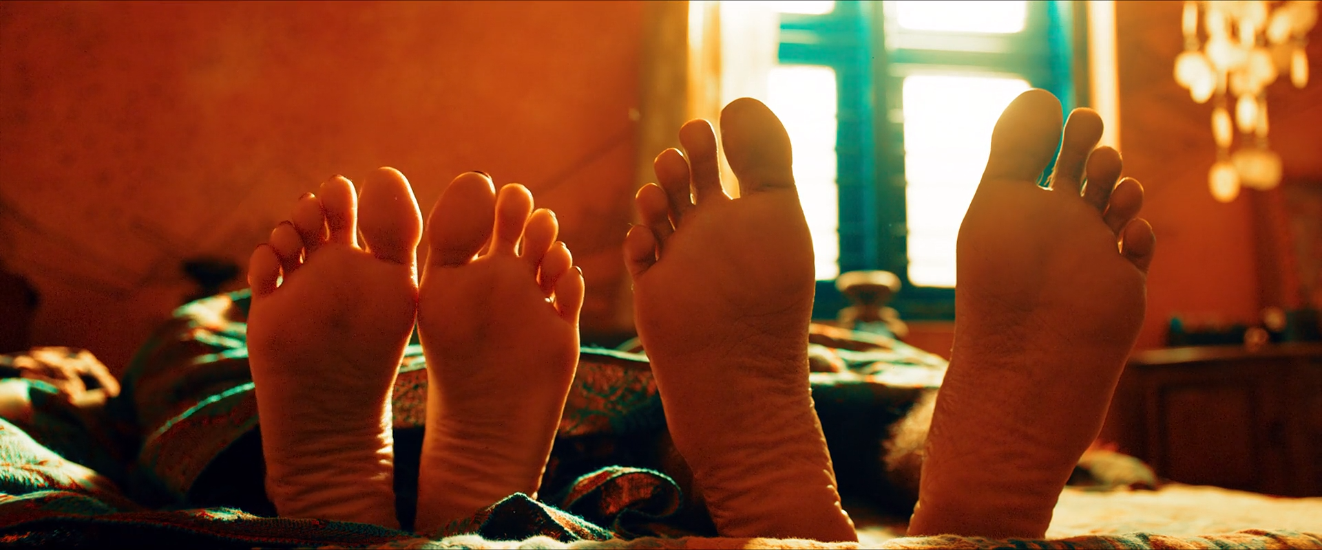
The frame is extremely chromatic without becoming flat. The feet are not cut out as conventionally neutral skin: their lit planes join the orange architecture, while creases, toenails and occlusion shadows preserve material difference. Almost ninety percent of classified chromatic pixels lean warm and mean chroma reaches 43 C*, yet the deep brown toe and the near-white window stop the image becoming a single swatch.
The window is structurally crucial. Its pale centre and green-cyan frame occupy little area, but their hue and high value give the orange somewhere to push against. Remove that counterweight and the same saturation feels like an effect; neutralize the feet and the spatial unity collapses.
Most of the result must precede grading: warm wall paint, warm bedding/skin exposure and a genuinely warmer key or practical reflection. A colourist can converge already-related reds, oranges and browns, deepen the lower mids and cool the window trim, but cannot make daylight-lit neutral skin acquire this internal colour separation without damage.
The finish likely benefits from a broad warm field plus selective density rather than one global temperature move. The pale window should be shaped independently, and the feet need local contrast so their form survives inside the warm field.
Can regular footage get there?
Regular log footage can approach it if the room, skin and key light already belong to a warm family and no RGB channel is clipped. Neutral walls under broad white light will require such an aggressive selective rotation that skin texture and edge colour are likely to break.
Composite and background read
Occlusion, depth, light direction and softness are internally consistent with a photographed room. The window could be controlled outside the set, but the still offers no specific edge or grain evidence of replacement.
A still cannot exclude cleanup, window work or invisible VFX; it only supplies no positive reason to invoke them here.
Shot-specific Resolve pass
Lower the toe while holding fine separation in the soles; compress the window with a soft shoulder rather than clipping it flat.
Why: The frame needs both dense occlusion and a luminous back plane.
Watch: Do not let every crease close to the same black.
Key wall, bedding and lit skin broadly; lower gamma slightly and steer red-orange variants toward a shared amber-orange axis.
Why: Density makes the colour feel saturated without requiring a global saturation spike.
Watch: Keep toenails and the darkest browns from becoming scarlet.
From a pre-look parallel branch, mix back a small amount of skin luminance and texture without fully neutralizing its hue.
Why: Anatomical form must remain readable inside the environmental colour.
Watch: A full skin-tone correction will look pasted on.
Track a soft window over the opening; cool its trim toward cyan-green and keep the centre pale with restrained saturation.
Why: The small cool area organizes the entire warm composition.
Watch: Hard key edges around the bars will betray the intervention.
02 · Practical fire · shot 107 · 01:15:02:18
The subject is allowed to become a graphic silhouette between amber practicals; cyan lenses and flare contamination carry just enough facial information.
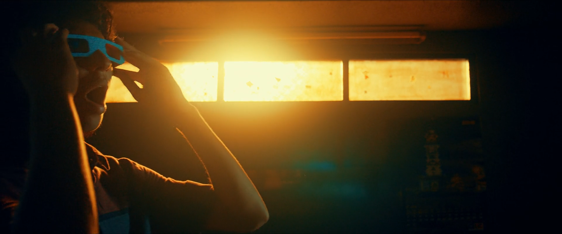
The brightness structure is brutally simple: more than sixty percent of the frame lies in the shadow zone while the three panels carry nearly all high-value mass. Yet the silhouette is not empty. The blue-green lenses, rim contamination and a few interior reflections let us infer a person without opening the face.
The practicals are not clean rectangles. Amber bloom, lens flare and veiling light soften the room around them. That optical contamination is what joins the windows to the silhouette; a tidy window key with crisp black foreground would feel diagrammatic.
The lamp colour, exposure ratio and real flare are capture decisions. In Resolve, the colourist can deepen the figure, keep the cyan lens reflections alive, compress the panels and add a small controlled glow, but cannot manufacture convincing flare paths or restore clipped filament/window texture.
A useful reconstruction treats the bright panels, the cyan lenses and the veiled room as three separate systems. Global contrast alone will either erase the lenses or make the practicals harsh.
Can regular footage get there?
Possible from ordinary log footage only if the source was lit with a similarly extreme ratio and retained both highlight colour and lens reflections. A normally exposed face against modest practicals cannot be pushed into this silhouette without looking underexposed rather than intentional.
Composite and background read
Flare and bloom cross foreground boundaries continuously, and the panels share compatible softness and grain. Their contents may be art-directed or treated, but there is no obvious matte edge in the still.
The inference concerns visible integration only; practical replacement and cleanup could remain invisible at this resolution.
Shot-specific Resolve pass
Lower shadow and dark-mid values until the body reads graphically, but leave the lens reflections and rim contamination above the toe.
Why: Opening the face weakens the frame's designed exposure hierarchy.
Watch: Check that compression blocks do not become the only facial detail.
Use separate soft windows to equalize panel density and keep the centre of each warm, not white.
Why: Panel-to-panel imbalance is conspicuous in such a reduced composition.
Watch: Do not force identical luminance if their photographed falloff differs.
Key the panel cores, tint the glow amber and mix a wide low-gain spread into the surrounding room.
Why: The flare softens the transition from light source to silhouette.
Watch: Glow must not reveal a halo around the subject's cutout.
Use a tracked qualifier/window to retain lens cyan and local brightness after the warm field is shaped.
Why: This tiny accent prevents total warm monotony.
Watch: Avoid electric cyan clipping or edge chatter on the glasses.
03 · Designed abundance · shot 133 · 01:17:40:16
A crowded wide frame contains many objects but very few uncontrolled hue families: architecture goes teal, devotional imagery and practicals go warm, and deep structure is allowed to disappear.
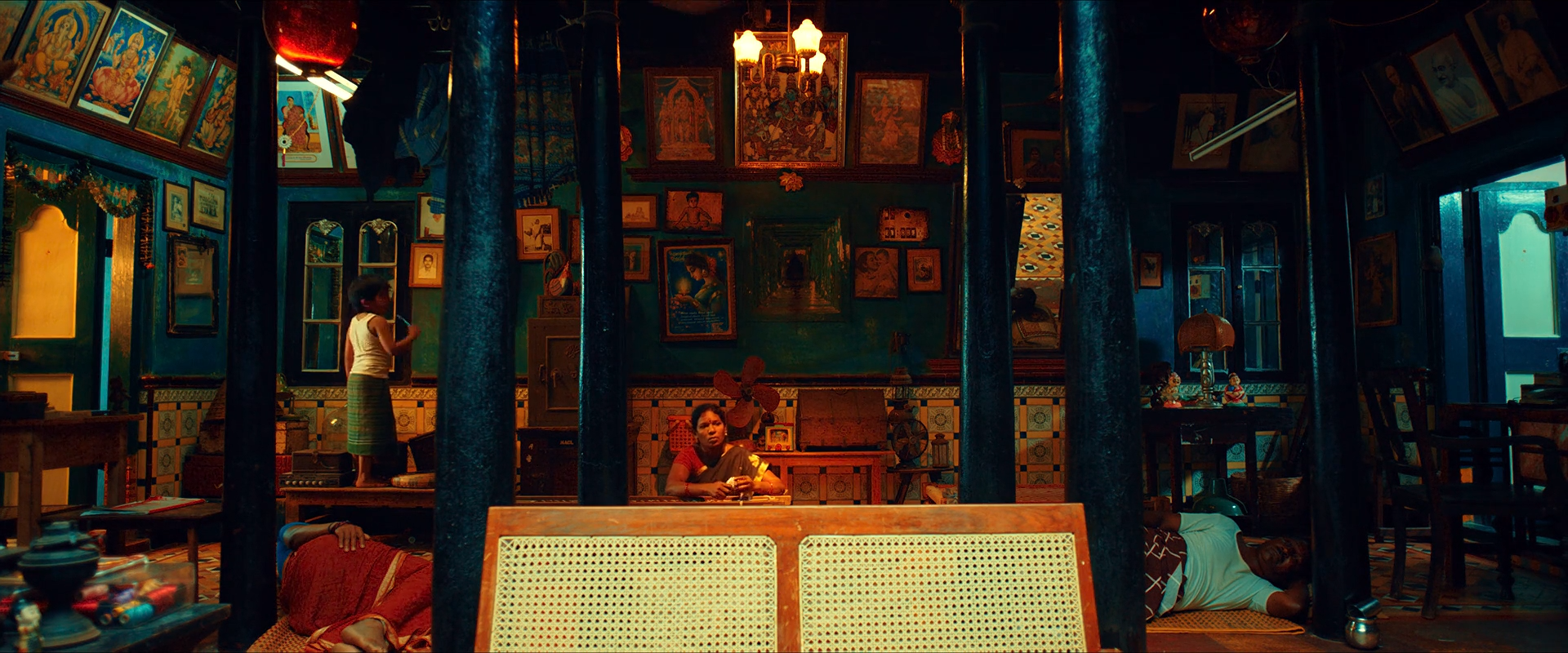
This is palette discipline at production scale. Printed pictures, walls, columns, garments, wood and faces could produce dozens of unrelated colours; instead they resolve into teal structure, amber-red subject matter and black negative space. The image remains busy in object count but economical in chromatic count.
The darkest shelves and overhead structure are not rescued. That density gives the small warm pictures and practicals enough contrast to function as a repeated rhythm. The grade is not merely teal-and-orange: it is selective suppression of every colour that would interrupt that rhythm.
Paint, props, wardrobe and lamp colour do most of the palette design. Resolve can rotate several neighbouring blue-green paints toward a common teal, suppress stray magentas/greens and locally warm faces and icons. It cannot make a randomly dressed, neutral shop acquire this distribution without obvious isolations.
The reconstruction should begin by balancing each architectural plane, then use broad palette compression. Hundreds of tiny object keys would be the wrong response; the look succeeds because the photographed colour groups are already coherent.
Can regular footage get there?
A regular interior can borrow the contrast and teal/amber axis, but not the convincing density of this frame unless set dressing, surfaces, costume and practicals were selected for it. Aggressive replacement of many unrelated hues will produce unstable keys and plastic surfaces.
Composite and background read
Depth cues, practical spill, occlusion and object-level grain are coherent throughout the store. Nothing in this still requires set extension or element replacement.
Invisible removals and cleanup remain possible; the claim is only that no visible reconstruction depends on a composite.
Shot-specific Resolve pass
Set exposure from faces and the warm pictures; preserve the teal bias in the room instead of globally neutralizing it.
Why: The environmental cast is an authored relationship, not a white-balance error.
Watch: A neutral wall balance will contaminate skin magenta.
Use broad Hue vs Hue and Warper moves to collect blue/green architecture into teal while suppressing isolated off-palette colours.
Why: The frame's clarity comes from fewer hue families, not lower object density.
Watch: Pin faces, icon reds and amber practicals before warping.
Key teal surfaces broadly and lower their gamma slightly; add only modest saturation after the values sit correctly.
Why: Dark teal feels richer than bright, globally saturated cyan.
Watch: Keep separation between pillars, back wall and window trim.
Use two or three large soft windows—not dozens of tiny ones—to lift the clusters of icons, lamps and people.
Why: Grouped shaping preserves the sense of natural practical spill.
Watch: Over-tracking individual pictures will make the room pulse in motion.
04 · Veiled depth · shot 232 · 01:28:49:06
Foreground translucency, silhouetted figures and a hot teal-framed window divide the room into several colour and contrast layers without clean edges.
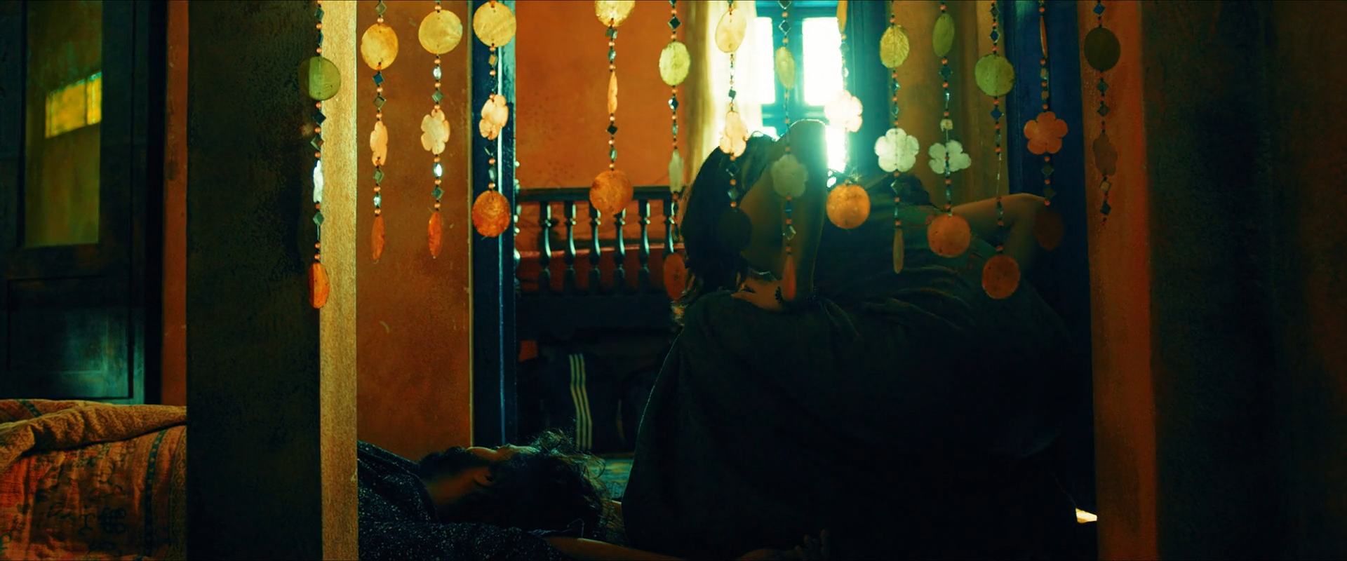
The frame is built from partial obstruction. Hanging strands catch light in hundreds of small warm highlights; the figures behind them remain mostly shadow; the window burns through both. Because no layer is perfectly isolated, depth comes from contamination and changing edge contrast rather than from neat subject-background separation.
The palette resembles other warm/teal scenes, but the technical problem is different: keys must survive transparency, fine texture and deep shadow. A strong global teal-orange operation would turn the strands into noisy chroma and flatten their layered opacity.
The beaded foreground, backlight and exposure ratio are photographic. The grade can deepen the human silhouettes, steer the wall toward amber and retain the teal frame, but it should respect colour mixtures already created by translucency. Fine mattes are likely to fail on the strands.
Local light shaping should use broad spatial zones. If the original material lacks the foreground layer, compositing one is possible, but then defocus, flare, motion and grain must be designed as part of the shot rather than added as a clean overlay.
Can regular footage get there?
The palette is achievable from suitable footage; the layered optical depth is not a grading product. Regular footage needs a real translucent foreground or a carefully integrated element, plus backlight strong enough to make it visible.
Composite and background read
The small highlights vary naturally with strand depth and cross the figures without obvious edge accommodation. Defocus and spill are coherent with an in-camera foreground layer.
A physically filmed foreground plate could still have been composited; the still cannot separate that from a single-pass photograph.
Shot-specific Resolve pass
Set the foreground highlights, mid-room walls and human silhouettes as distinct value bands before adding colour.
Why: Depth will collapse if the strands and window occupy one bright register.
Watch: Do not lift the figures until they compete with the strands.
Use broad spatially intersected keys for amber walls and teal window trim; avoid qualifying the fine foreground.
Why: Broad planes are stable while filament-like keys chatter.
Watch: Check mixed-colour edges around every strand at 100%.
Track a soft Outside window around the figures and lower surrounding midtones enough to keep their silhouettes legible.
Why: The subjects need hierarchy without conventional face exposure.
Watch: A visible oval vignette will destroy the physical layering.
Add a very low-gain, wide bloom sourced only from the brightest opening.
Why: A little veiling light helps join foreground and back plane.
Watch: Do not bloom each bead independently.
05 · Portrait in a coloured room · shot 443 · 01:49:04:07
A red sari and teal floral blouse frame a warm face inside a dark cyan-teal room; the portrait is separated by value, texture and costume before it is separated by hue.
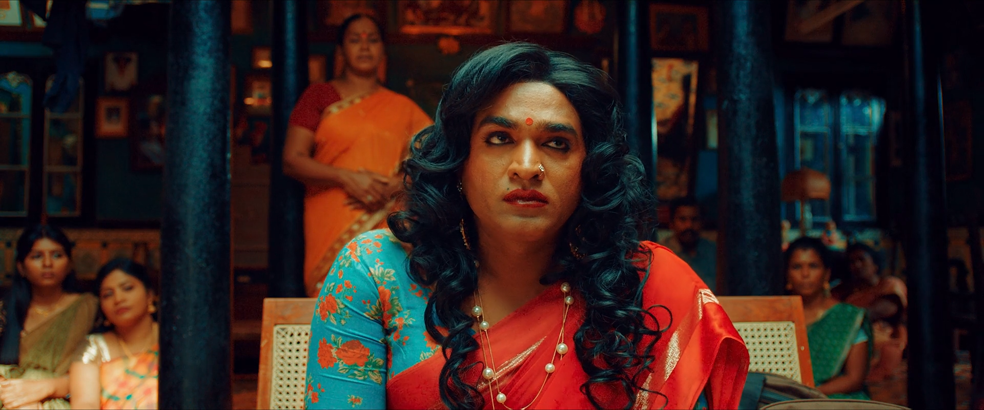
The face is neither neutral nor aggressively orange. It retains the room's colour contamination while remaining warmer and lighter than its surroundings. The dark curls create a near-black frame around the skin; the blouse repeats the room hue at a brighter value; the red sari provides a second narrative accent.
This is a useful example of separation without a cutout. The face key is probably broad and low-gain if one is used at all. Costume and lighting already create the hierarchy, allowing the grade to preserve shared colour rather than erasing spill.
Wardrobe, hair, makeup and a controlled key light give the colourist three separable materials. In Resolve, teal room/costume can be converged and darkened, skin can be gently protected in parallel, and the sari can be kept dense rather than over-saturated.
Ordinary neutral footage with a warm face against a grey room can mimic the axes, but it will not reproduce the natural teal reflections in hair, skin shadow and cloth. Those mixed pixels are a photographic advantage, not contamination to eliminate.
Can regular footage get there?
Of the eight studies, this is one of the most transferable. A normal portrait with a dark cool environment, warm key, suitable costume and log capture can be shaped convincingly without heroic keys.
Composite and background read
Hair edges, spill, depth and texture behave coherently with a photographed room. The colour relationships can be explained by lighting, wardrobe and grading.
Beauty work or cleanup cannot be ruled out, but no background replacement is needed to explain the frame.
Shot-specific Resolve pass
Set a dense toe while keeping curl texture and blouse pattern just above it; hold the face in the middle register.
Why: The dark hair is a compositional border, not dead black.
Watch: Do not create a black helmet around the face.
Key the room and teal blouse broadly, lower gamma, then make a small hue convergence toward cyan-teal.
Why: Matched density connects costume to environment.
Watch: Keep floral print and wall surfaces distinct.
Track a soft face window plus broad skin key; mix back luminance and 5–15% warmth from the pre-look branch.
Why: The face should survive the environment, not be detached from it.
Watch: Do not force the skin onto a neutral scope line.
Use Hue vs Sat/Lum to keep red dense and textured while preventing channel clipping.
Why: The sari is a controlled accent, not the brightest object.
Watch: Inspect folds in the red channel parade.
06 · Narrow-spectrum red · shot 525 · 02:00:20:15
A saturated practical turns skin, wall and air into different densities of red while hair and clothing remain nearly black and the scene offers no neutral refuge.
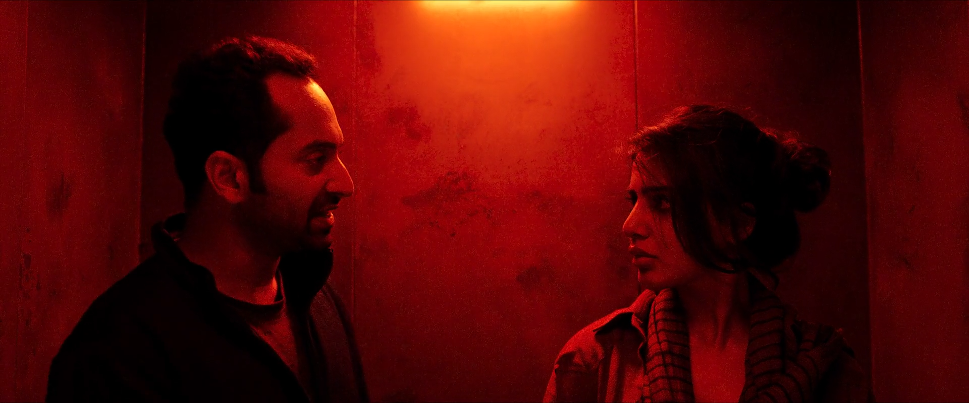
This is the report's most extreme chromatic frame: warm balance is effectively total and mean saturation approaches 0.94. Yet form comes from red-channel value differences, specular placement and silhouette—not from hue variation. Skin, paint and air do not become the same flat red because their exposure and reflectance remain different.
The absence of neutral information is the point. Trying to preserve textbook skin colour would introduce an alien orange patch. The technical task is instead to keep red-channel texture, restrain noisy blue/green channels and maintain a soft transition from practical core to illuminated faces.
A genuine red source is indispensable. A global red tint applied to white-lit footage produces different channel ratios, leaves implausible neutral speculars and often drives already-bright skin into clipped red. The grade should refine a photographed red scene: deepen blacks, compress secondary hues, shape the practical and selectively retain facial texture.
If the light is a narrow-spectrum LED, some colours and skin separation were never recorded. Raw capture cannot reconstruct spectral information that never reached the sensor; the reconstruction must accept that limitation rather than create false multicolour skin.
Can regular footage get there?
Conventional footage can be tinted red, but it will rarely reproduce the material response of a room actually illuminated by a saturated source. It is achievable when the red was photographed and the sensor retained unclipped detail.
Composite and background read
Falloff, specular response and silhouette behaviour are coherent with one dominant red source. No visible spatial discontinuity suggests a composite.
The practical itself may have been enhanced, but the still does not require replacement or background compositing.
Shot-specific Resolve pass
Set face and practical exposure using Offset/HDR controls while leaving the red cast intact.
Why: White balancing against the source removes the photographed spectral premise.
Watch: Read individual RGB channels; luma alone hides red clipping.
Build a soft toe and midtone curve that preserves differences between skin, wall and clothing inside the red channel.
Why: Value separation substitutes for hue separation.
Watch: Avoid posterized red gradients in the eight-bit reference or compressed originals.
Suppress blue/magenta contamination and converge warm variants carefully without flattening every red object.
Why: The field should feel spectrally narrow, not digitally painted.
Watch: Broad Hue vs Hue moves can produce seams around speculars.
Reduce saturation in the practical core and deepest noise floor; keep midtone reds dense.
Why: The red should remain saturated where information exists and calm where it does not.
Watch: Do not desaturate highlights to white.
07 · Interior against exterior · shot 610 · 02:12:56:02
The cabin is richly coloured and comparatively dark while a huge exterior remains bright, warm-neutral and readable through multiple windows—a capture and integration problem before it is a look problem.
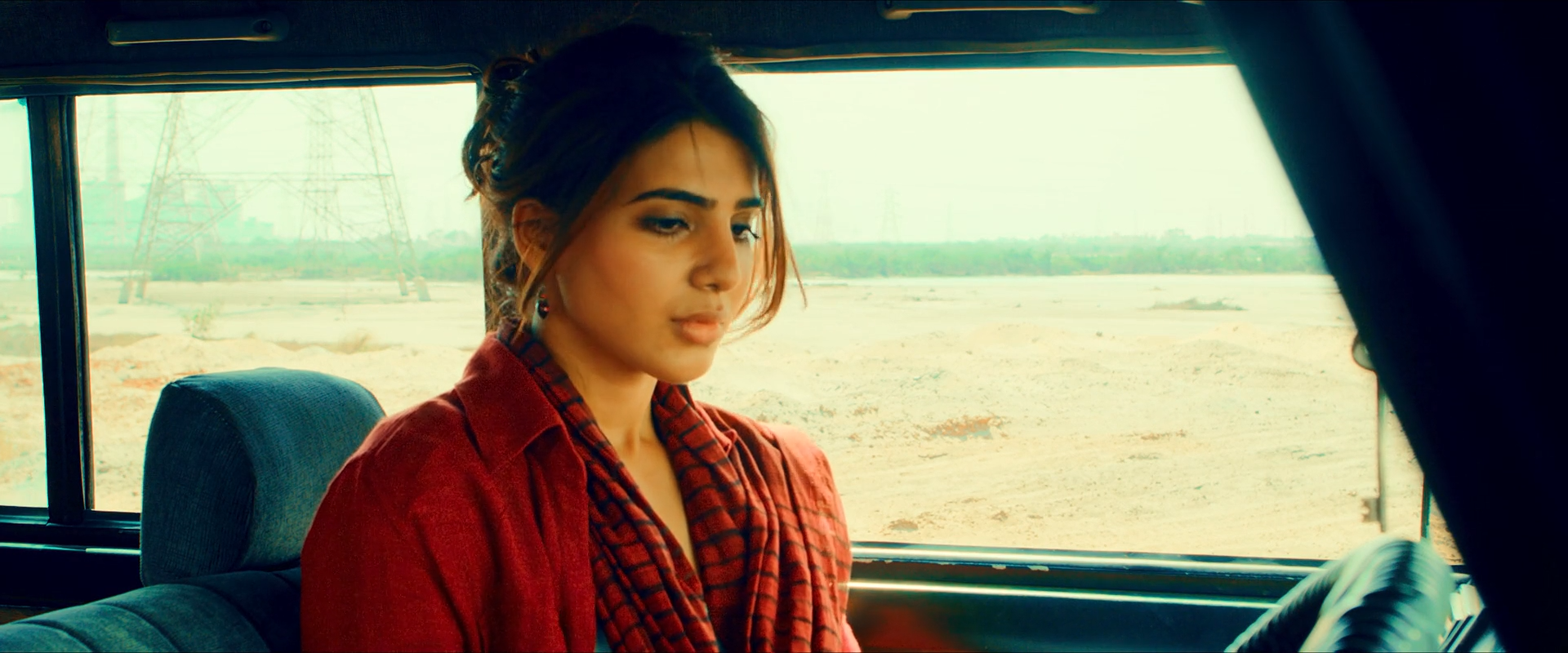
The frame spans unusually separated exposure worlds: roughly forty-three percent falls in the highlight zone while a similar fraction remains in shadow. The saturated red costume and teal upholstery live between them. The grade lets the exterior approach white without erasing its warm ground line, and lifts enough interior colour to avoid a silhouette without pretending both spaces share one exposure.
The window shapes create multiple edges where any mismatch in sharpness, flare, grain, colour temperature or light direction becomes obvious. Whether captured with filtration, fill, a plate or a combination, the final image succeeds because the bright world spills into the cabin rather than sitting behind it as a clean rectangle.
This requires exposure control: strong interior fill, exterior timing, ND/gradation, a latitude-rich sensor, window plates or some combination. Resolve can compress the exterior, shape the cabin, align the palette and add integration contamination, but it cannot recover a clipped salt flat or convincingly relight an underexposed passenger from one still.
Treat every window as part of one exterior system, then let separate broad windows shape the passenger and upholstery. If plates exist, perform edge, defocus and grain integration before the creative grade so later colour moves affect the composite coherently.
Can regular footage get there?
Modern raw/log footage can approach the relationship if both interior and exterior were retained. With a clipped window or severely underexposed cabin, the grade alone cannot solve it; a plate or relight becomes necessary.
Composite and background read
The exterior holds an enormous bright area while the cabin remains colourful and controlled, a ratio commonly managed with fill, filtration, plates or all three. The still is compatible with compositing but does not show a decisive matte edge.
This is a production inference from dynamic range and integration difficulty, not proof. A high-latitude capture with strong fill and careful timing could also produce the frame.
Shot-specific Resolve pass
Compress the exterior shoulder while keeping the cabin toe dense; do not force both into the same middle-grey range.
Why: The brightness discontinuity is spatially and narratively credible.
Watch: Flat HDR-style compression will remove the feeling of glare.
Track broad windows for face/torso and upholstery, lifting no more than the clean source allows; add an Outside falloff toward cabin edges.
Why: Interior hierarchy cannot be solved by opening all shadows globally.
Watch: Watch window-edge halos and tracking through reflections.
Steer upholstery toward teal and keep costume red dense, using separate spatially constrained keys.
Why: The two saturated anchors keep the high-key exterior from dominating the whole image.
Watch: Do not key red reflections in skin as costume.
Use restrained bloom/veiling light from the exterior and match edge softness, grain and black contamination across window boundaries.
Why: A perfect hard separation reads immediately as a plate.
Watch: Added haze must respect actual window geometry and lens direction.
08 · Fluorescent possession · shot 1143 · 03:21:14:13
A fluorescent corridor becomes a near-monochromatic green volume while a red-teal sari and small skin traces prevent the walking figure from dissolving completely.
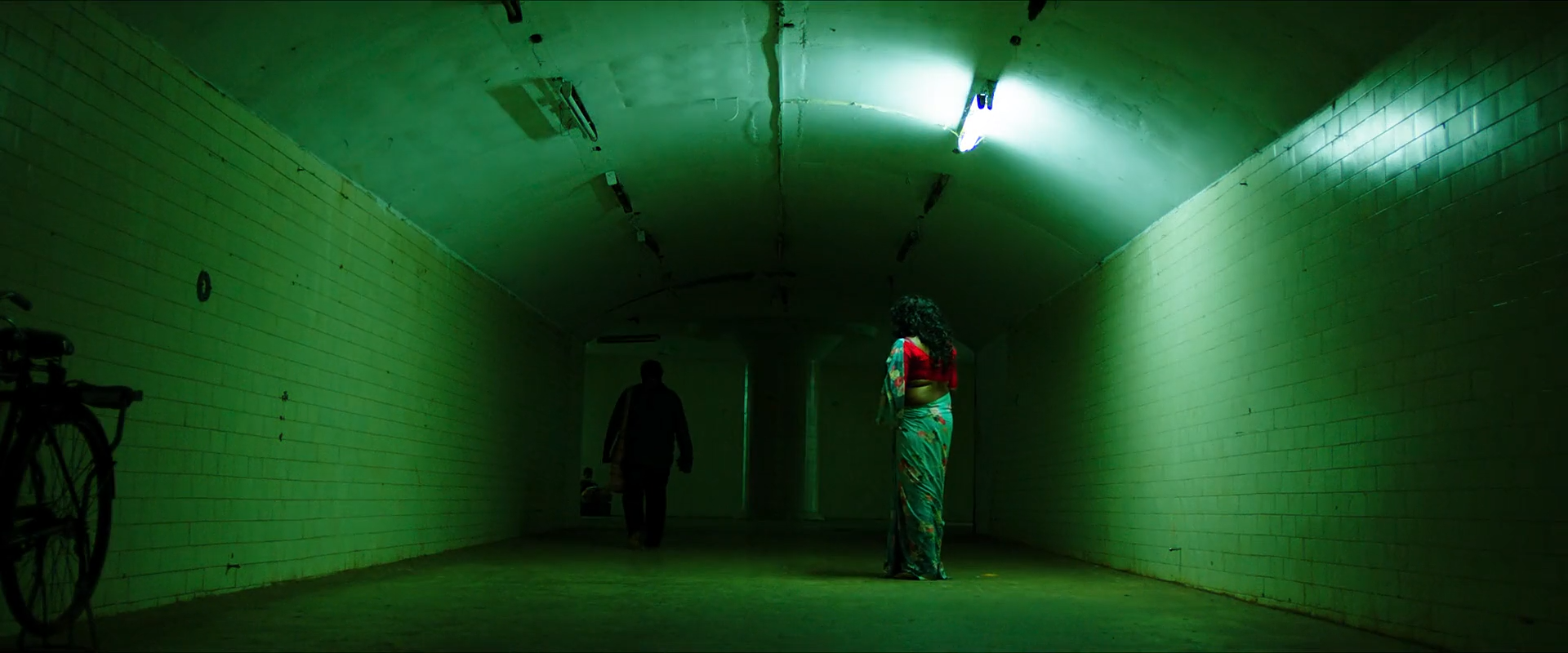
The environment is not simply tinted green. Ceiling fixtures, wall reflections, floor, haze and shadow all express related but different green values. The figure is mostly silhouette, yet costume red and teal survive as discontinuous accents. With warm balance near zero, the image commits to its source colour rather than correcting it away.
Perspective carries as much force as chroma: repeated fixtures and converging walls build a luminous corridor around the small body. If the tunnel were flatly exposed, extra green saturation would not restore this depth. The grade reinforces illumination falloff and colour density already embedded in the space.
Narrow-spectrum fluorescent or green-gelled lighting and a reflective tunnel are foundational. The grade can converge yellow-green/cyan variations, deepen inter-fixture shadows, and protect costume accents. It cannot create credible green bounce and spectral response from evenly white-lit neutral walls.
Because the selected midpoint lasts less than half a second, this still supports no claim that the colour remains stable through movement. Any reconstruction key must be validated across adjacent frames; the report describes only the sampled image.
Can regular footage get there?
A global green cast is easy; a believable green light volume is not. Regular footage needs actual coloured illumination, reflective surfaces and exposure gradients. Otherwise skin, floor and walls inherit the same synthetic matrix shift.
Composite and background read
Repeated perspective, source reflections and body occlusion are coherent. The still offers no specific set-extension seam, although cleanup or extension remains possible.
The very short shot duration and single midpoint prevent a temporal edge or flicker assessment.
Shot-specific Resolve pass
Set exposure without neutralizing the fixtures; correct only unwanted global magenta/cyan bias that prevents the green family from cohering.
Why: The coloured illuminant is the scene, not a cast to remove.
Watch: A white-balanced tunnel will demand destructive re-colouring later.
Use shallow Hue vs Hue/Warper moves to gather yellow-green and cyan-green surfaces while retaining value variation.
Why: A controlled family feels volumetric; one exact green feels keyed.
Watch: Avoid sharp hue bends in floor and wall gradients.
Use long, soft perspective-aware windows to deepen spaces between fixtures and hold the figure's central path.
Why: Repeated value falloff creates corridor depth.
Watch: Do not create a moving spotlight disconnected from the ceiling sources.
Track the figure and mix back limited red/teal costume chroma from before the green field.
Why: Small colour exceptions keep the subject readable.
Watch: A complete neutral bubble around the person will look composited.