Eight depictive frames showing how practical signage, low exposure, restricted colour families, contaminated optics and selective density make Tokyo feel luminous without turning every surface into an effect.
Enter the Void is often remembered as an onslaught of colour, yet its photographed scenes are built on restraint: immense areas of near-black, one or two motivated colour families and practical sources whose apparent brightness comes from local contrast as much as raw level. Neon does not simply tint the frame. It identifies depth, separates people from unlit space and leaves parts of the city deliberately unreadable.
This report excludes the abstract red bloom, pure strobe fields, rendered titles and other non-depictive trip imagery in the source corpus. The selected images remain cinematic scenes with identifiable people, rooms, streets or architecture. The reconstruction task is therefore to reproduce photographed relationships while stating clearly where lighting, production colour, optics, camera access or VFX must precede the grade.
Subject
Enter the Void
Studies
8 frames
Measured against
2391 eligible midpoint frames
Interpretation
gamma24
The film-level construction
What holds the look together
Black is active space
Large portions of the image sit close to black, but the remaining edges, reflections and practicals still describe depth. Raising the floor globally makes the city smaller and reveals noise that the composition never asks the viewer to read.
Sources carry the palette
Neon, fluorescent panels, bedside lamps and coloured architecture establish the colour families before grading. The finish increases density and coherence around those sources rather than manufacturing free-floating colour on neutral footage.
Warmth wins by area; green survives by placement
Amber, red and dirty yellow frequently occupy the broad field. Green appears in smaller but strategically bright planes—signage, garments, windows or reflected light—so a modest cool-green element can organize a much warmer frame.
Contamination is not uniform
Bloom, veiling flare, soft focus, haze and coloured spill reduce local contrast around bright sources while other parts remain hard or almost unlit. One global glow pass cannot reproduce this spatially uneven optical behaviour.
Resolve blueprint
A node tree built to be adjusted, not copied blindly
Normalize known camera originals into DaVinci Wide Gamut / DaVinci Intermediate through Resolve Colour Management or one documented input CST. Establish exposure and the black architecture before building any neon branches. The display-reference PNG can be transformed from Rec.709/gamma 2.4 for comparison, but its clipped and quantized channels remain clipped and quantized.
Keep practical colour, skin and environment on separable branches. The look depends on unequal contamination: a sign can spread colour into haze and nearby surfaces while a face or deep background follows a different density curve. Suggested values below are starting ranges for suitable log/raw footage, not portable presets.
Group Pre-ClipE01
Input transform
Normalize each known camera or VFX source without baking the creative neon look into the input transform.
Do this
For raw, decode with the documented camera gamut/gamma and retain highlight recovery.
For log, use a CST from the known source to DaVinci Wide Gamut / DaVinci Intermediate; give VFX plates their own correct transforms before compositing.
If project colour management already supplies the input transform, bypass this node rather than applying it twice.
Starting points
Leave creative tone mapping out of the IDT; reserve display mapping for E12.
For the supplied reference only, interpret Rec.709 gamut with gamma 2.4 provisionally and expect weak saturated-channel recovery.
Watch
A guessed input gamma changes black placement and every qualifier boundary.
Confirm full versus video levels before treating lifted or crushed blacks as an authored look.
Clip · serialE02
Exposure and motivated balance
Place the negative or sensor exposure while preserving the colour of practical and environmental light.
Do this
Use Offset for the large exposure move, then HDR Global or Log wheels for smaller zone corrections.
Balance only against a credible neutral; do not neutralize a room whose visible source is amber, green or magenta.
Set skin exposure from shape and texture rather than forcing a conventional skin hue under coloured light.
Starting points
For well-exposed log, begin inside roughly ±0.4 stop and reassess the source if a larger rescue is needed.
Keep temperature/tint corrective; use later parallel branches for deliberate colour fields.
Watch
A global neutralization can remove the motivation for every colour in the frame.
Lifting offset to find the room may destroy the source-to-black ratio.
Clip · serialE03
Toe and shoulder architecture
Create a deep but graduated lower register and a soft practical-light shoulder before selective colour work.
Do this
Shape the toe with Custom Curves or HDR Shadows while retaining a narrow band of separation above display black.
Build midtone contrast with a pivoted curve, then compress hot signs and bulbs with HDR Highlights/Specular rather than a hard clip.
Inspect individual RGB channels as well as luma; saturated signs can clip chromatically before the waveform top.
Starting points
Contrast about 1.08–1.22 with pivot 0.36–0.44 is a useful first test, not a target.
Let dark scenes keep a majority of pixels in the shadow zone when silhouettes and key edges remain legible.
Watch
A crushed toe turns purposeful black into flat holes and makes tracked keys brittle.
An early shoulder can grey practical cores and erase their colour-temperature hierarchy.
Clip · serialE04
Palette convergence
Steer photographed hues toward a limited amber/red/green family while suppressing unrelated colour noise.
Do this
Use broad Hue vs Hue curves for shallow rotations of adjacent warm or green families.
Reduce off-palette cyan, blue or magenta with Hue vs Sat before increasing hero colour.
Use Color Warper in Chroma–Hue with pins around protected skin and source colours.
Starting points
Start with hue rotations of 3–10 degrees and off-palette saturation reductions of 10–25%.
Prefer density from gamma or log-zone placement before adding global saturation.
Watch
Large hue rotations reveal eight-bit macroblocking and create discontinuities in soft gradients.
Converging every warm object to the same orange removes material separation.
Clip · parallelE05
Faces and narrative colour
Keep faces, costumes and story-bearing colour distinct without making them look neutralized or pasted over the environment.
Do this
Build a broad pre-look HSL/RGB key and combine it with a tracked window when skin overlaps warm walls or light.
Adjust luminance and density before hue; mix the branch back through a Parallel Mixer at restrained gain.
Protect the intended garment or prop colour separately when it shares hue with skin.
Starting points
Key Output Gain around 0.25–0.65 often integrates better than a full correction.
Try ±0.10–0.30 stop and 5–20% saturation change before stronger interventions.
Watch
Skin under green or amber light is not required to sit on a conventional scope line.
Check hair, hands, teeth and motion blur at 100% for qualifier chatter.
Clip · parallelE06
Practical-light branches
Control individual sign, lamp, fluorescent and reflected-light families without flattening their different intensities.
Do this
Separate warm signage, green/cyan sources and pale practical cores by a combination of hue, luminance and broad spatial windows.
Change keyed gamma/gain before saturation so the source appears dense rather than electronically coloured.
Treat bright cores and coloured skirts on separate nodes when the display reference shows both.
Starting points
A 0.05–0.20 gamma reduction plus 5–20% saturation can be more convincing than a large saturation boost.
Keep luminance keys soft enough to include falloff but exclude faces and neutral fixtures.
Watch
Uniform practical brightness makes depth collapse.
Narrow keys on encoded references will crawl across flicker, compression and defocus.
Clip · serialE07
Local hierarchy
Use broad tracked shaping to decide which face, source or architectural plane can emerge from darkness.
Do this
Use large soft windows for subject lift, edge darkening and motivated spill.
Track only the motion parameters actually present and manually correct drift.
Use an Outside Node when holding a source or face while making the surrounding city denser.
Starting points
Prefer local moves of roughly ±0.10–0.35 stop with very broad feathering.
Judge windows at normal viewing size, then inspect edges at 100%.
Watch
Visible vignettes are usually a geometry or tracking failure.
A window cannot replace missing production light or restore clipped colour channels.
Clip · serialE08
Luminance-dependent colour
Keep neon rich while preventing chromatic noise in black and hard colour clipping in source cores.
Do this
Use Sat vs Lum or a luminance key to taper saturation in the deepest shadows.
Compress saturation gently at the top of the signal while keeping the practical's coloured skirt.
Use gamut compression before hard clipping and inspect the encoded deliverable.
Starting points
Test a 20–50% saturation reduction below the lowest 5–12% of the signal.
Taper only the upper 5–10% first; broad highlight desaturation makes signs chalky.
Watch
Green and red channels may clip while luma still appears legal.
Removing all shadow colour also removes legitimate spill and atmosphere.
Clip · optionalE09
Optical contamination
Reconstruct source-specific bloom, halation, veiling flare and haze only where the photographed image supports them.
Do this
Key high-luminance sources for a restrained Glow and tint the spread from the source rather than globally.
For veiling flare, use a broad low-opacity contrast-lowering layer in the affected region rather than glow alone.
Separate chromatic fringe, softness and overall haze so each can be disabled independently.
Starting points
Begin with a high threshold, spread 0.04–0.18 and gain 0.04–0.20.
Blur the key before raising gain; keep the effect invisible when the source branch is soloed against black.
Watch
Global glow turns text, eyes and skin sheen into light sources.
Added bloom makes clipped sign cores and composite edges more obvious.
VFX / Clip · parallelE10
Environment and VFX integration
Match plates or constructed environments in perspective, defocus, channel response, atmosphere and texture before the shared look.
Do this
Transform every element correctly before compositing and match exposure/white balance in scene space.
Match depth-dependent softness, motion blur, lens distortion and atmospheric falloff before applying palette convergence.
Use edge treatment and grain at delivery resolution; do not hide mismatched blacks with a global crush.
Starting points
Compare plate and foreground at 100% with the look bypassed.
Use shared finishing grain only after element-specific noise and sharpness are coherent.
Watch
Uniform sharpness across distant architecture exposes environment work.
Black-level mismatches and coloured fringes become conspicuous after the toe is deepened.
Group Post-ClipE11
Texture and grain
Preserve tactile faces and dirty city surfaces while unifying keys, denoise and possible VFX layers.
Do this
Apply conservative temporal/spatial noise reduction before local texture decisions.
Use Midtone Detail by region rather than one global softness control.
Add fine delivery-scale grain after resizing and most sharpening, then inspect in motion at 100%.
Starting points
Start Midtone Detail between about −15 and +8 according to the material.
Use low-strength, fine grain with restrained chroma; the reference's compression texture is not a grain model.
Watch
Shadow denoise can smear coloured reflections and hair edges.
Strong grain becomes mosquito noise after streaming compression.
Group Post-ClipE12
Output transform and trim
Render the working space to the actual delivery and keep SDR/HDR display trims separate from the scene look.
Do this
Use Resolve Colour Management or a CST from DWG/Intermediate to the target gamut and transfer.
Enable suitable tone and gamut mapping, then inspect saturated signs for channel compression.
Create separate trim versions for each display rather than modifying the shared scene-referred graph.
Starting points
For comparison with these PNGs, monitor Rec.709 gamma 2.4 in controlled surround.
Use soft clip only as a final guard, not as the primary shoulder design.
Watch
Do not apply a monitoring LUT and a second output transform.
Recheck black separation and neon texture in the encoded deliverable, not only the Resolve viewer.
8 reconstruction studies
Read the image first; use the scopes to test the read
Each study begins with what is visibly present, then separates capture and production decisions from plausible grading and VFX work. Measurements describe only the active midpoint frame and never identify objects or prove that a relationship persists through the shot.
Build the global graph with optional nodes disabled. Add only the branches named by the shot recipe, test keys at full resolution and inspect the moving image before treating any tracked window or narrow hue adjustment as finished.
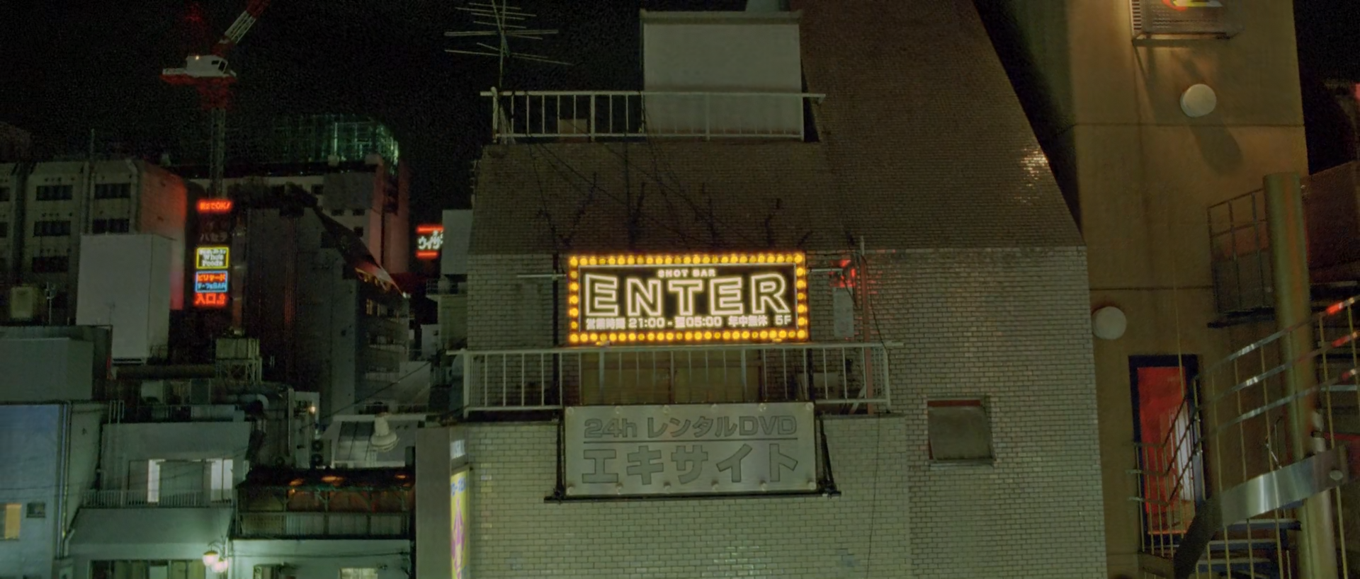
01 · The first photographed sign · shot 280 · 01:02:15:00
One word holds a rooftop together
A rectangular ENTER sign becomes the warm centre of a mostly unlit rooftop, while small green, red and white sources establish depth without lifting the night field.
The ENTER sign is the warm anchor; scattered windows, railings and smaller signs keep the surrounding rooftop legible against black.
What is remarkable
The frame refuses the usual night-exterior bargain in which every facade is raised for readability. Nearly two thirds of its pixels fall in the configured shadow zone, yet the tiled wall, railings, rooftop equipment and distant buildings remain separable because their values step away from black in narrow bands. The central sign occupies little area but its hard rectangular border and warm bulbs organize the whole composition.
Colour works by scarcity. The measured palette is dominated by near-black, olive-grey and brown rather than by the sign's bulbs. Small red and green sources appear as depth markers, while the facade retains a subdued green-grey cast. A reconstruction that simply increases neon saturation will miss the more important ratio between source intensity, wall density and unlit space.
Where the image comes from
The sign, layered rooftop access and real pools of local light must exist in capture or in properly integrated environment work. Exposure needs to retain the sign border and tiled-wall texture without asking the deepest roofs to become clean. A grade can suppress stray hue, deepen the unlit field and selectively shape each source, but cannot create the same spatial logic from a flat, evenly exposed facade.
Begin with a deep graduated toe, then treat the ENTER bulbs, the green-grey facade and the small background signs on separate branches. Optical spread should follow only the brighter sources. Do not let a broad vignette replace the actual architectural falloff.
Waveform
RGB distribution
Vectorscope
Can regular footage get there?
Conditional
Regular night footage can reach this hierarchy when practical signage and facade exposure are captured together in log/raw with protected source cores. A neutral building with clipped LED signs cannot be repaired into the reference by colour separation alone.
Minimum capture conditions
Practical signs or controllable replacements that contain both a bright core and coloured falloff.
Enough exposure for wall and railing separation without raising ambient fill across the roof.
Stable log/raw channels around small saturated red, green and amber sources.
Composite and background read
A photographed rooftop remains the simplest reading
Perspective, occlusion, source falloff and facade texture are mutually coherent. Sign replacement or cleanup is plausible production work, but the still provides no decisive edge, grain or reflection mismatch.
This midpoint cannot exclude invisible sign replacement, cleanup or an extended city background; it only offers no strong visual reason to require them.
Shot-specific Resolve pass
Use the global tree, then make these decisions
E03
Build the black architecture
Lower the toe until the empty sky and deepest roof planes approach display black, while retaining narrow separation in rails, tiles and machinery.
Why: The sign feels bright because the surrounding value ladder is compressed but not erased.
Watch: Do not close the facade mortar and railing edges into one black mass.
E06
Separate source families
Use broad spatially constrained keys for the amber ENTER sign, minor green sources and red accents; shape density and core roll-off independently.
Why: Different source families create depth rather than one global neon wash.
Watch: Keys must not grab tiled wall texture or compression blocks.
E08
Protect the coloured cores
Taper saturation only in the brightest few percent and apply gamut compression before output.
Why: The bulbs need pale centres with coloured skirts, not hard yellow clipping.
Watch: Check red and green channels individually even when luma is below peak.
E09
Add source-specific spread
Apply low-gain bloom to the sign bulbs and the brightest small sources, using separate thresholds where their levels differ.
Why: Unequal optical spread integrates the practicals with the night air.
Watch: The ENTER letter edges must remain readable and the wall must not acquire a uniform haze.
Failure modes to check before approval
Raised blacks that reveal noise but flatten rooftop depth.
Clipped amber channels along the ENTER border.
A global glow halo around every bright edge.
Over-saturated minor signs competing with the central word.
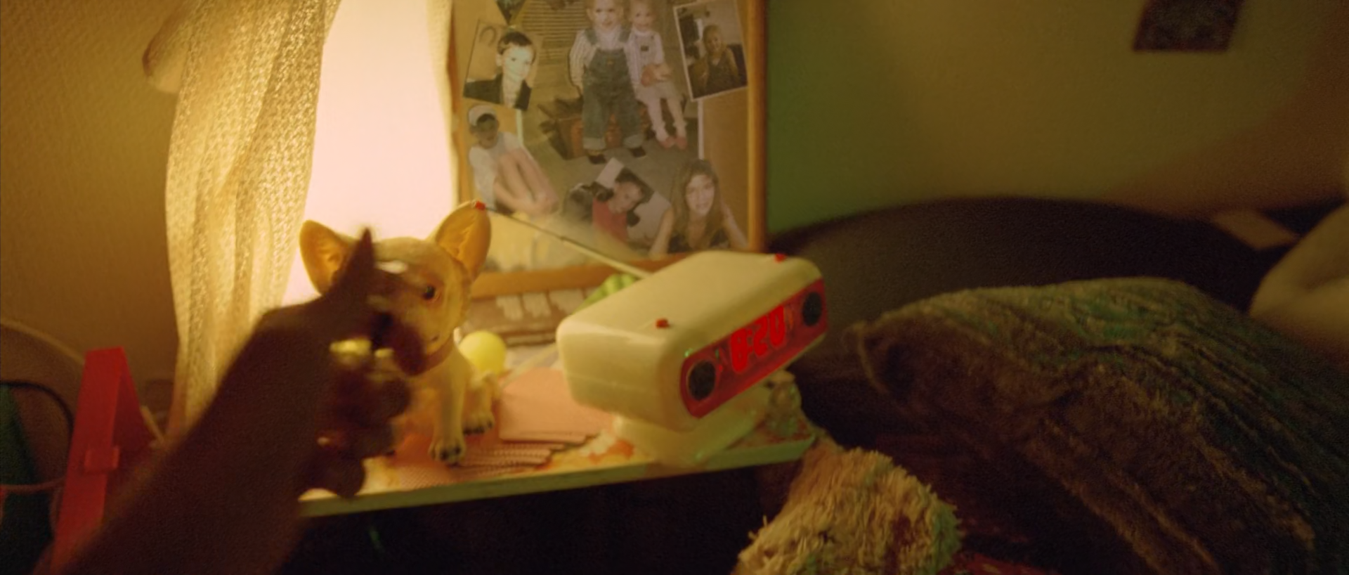
02 · Bedside practical · shot 336 · 01:04:30:23
A lamp turns clutter into one warm pool
A reaching hand, animal figurines, an alarm clock and pinned photographs share amber light from a curtained window or lamp, while the bed falls away into brown-green shadow.
The hand and bedside objects sit inside one amber pool; the pale curtain and clock carry the highlight, and the bed retreats into green-brown shadow.
What is remarkable
This is a close-range practical-light problem rather than a global warm grade. The pale curtain, white clock, skin, red plastic and dark blanket all receive related amber light, but their materials remain distinct through value, local contrast and texture. The frame's high mean chroma and nearly all-warm classified chromatic pixels are supported by visible warm illumination, not by a neutral scene pushed indiscriminately toward orange.
The strongest source area occupies the upper centre, yet the hand remains the subject because its silhouette crosses that brightness and the small figurines provide sharp shape cues. Warmth is not uniform: the bed retains a muted green-brown cast, and the deepest shadow around the hand is less saturated.
Where the image comes from
The practical direction, close inverse-square falloff, object colours and textured bedding must be photographed. The curtain or lamp needs enough size to wrap the hand while leaving the right side substantially darker. A colourist can align related yellows and oranges, hold the clock display, darken the bed and tune the shadow contamination, but cannot create this dimensional falloff from broad flat light.
Reconstruct with exposure and shoulder first. Use a broad warm branch for the lit tabletop, a softer subject window on the hand and a separate low-luminance operation that prevents the shadows from turning chromatic mud.
Waveform
RGB distribution
Vectorscope
Can regular footage get there?
High
Suitable log/raw footage under a warm, directional practical can reproduce the visible relationships with ordinary primary, curve, window and selective-colour tools. The decisive condition is captured light falloff, not an exotic post process.
Minimum capture conditions
A large or diffused warm source close enough to create real falloff across the bedside.
Protected detail in the pale curtain, white clock and reflective fingertips.
Production colours that remain separable after a broad warm convergence.
Composite and background read
No visible reason to invoke compositing
Focus, occlusion, contact shadow and warm spill behave coherently across the hand, figurines, clock, photographs and bedding.
Invisible cleanup or display replacement cannot be ruled out from one still, but no positive integration cue calls for it.
Shot-specific Resolve pass
Use the global tree, then make these decisions
E02
Place the practical exposure
Use Offset and a small highlight correction to keep the curtain luminous while retaining clock and hand texture.
Why: The whole look depends on a bright source plane that does not become a featureless white patch.
Watch: Do not cool-balance the lamp against the white clock.
E03
Shape the falloff
Build a soft toe and compressed shoulder, keeping the midtone jump between tabletop objects and bed intact.
Why: Value separation does most of the modelling before saturation is touched.
Watch: The bed should remain textured rather than sealed black.
E04
Converge the ambers
Gently steer yellow-orange variants toward a shared warm axis while pinning the muted green-brown blanket.
Why: The pool reads as one source even though objects retain different material colour.
Watch: Do not make skin, curtain, plastic and wood the same hue.
E07
Keep the hand primary
Track a broad soft window on the hand and figurines for a slight midtone lift and local contrast hold.
Why: The subject must survive against the brighter curtain without looking separately lit.
Watch: A hard window edge will appear across the clock and bedding.
Failure modes to check before approval
Neutral highlights that break the motivated amber source.
Orange shadow noise after global saturation.
A lifted bed that weakens the near-to-far falloff.
Over-sharpened tabletop objects against a soft optical image.
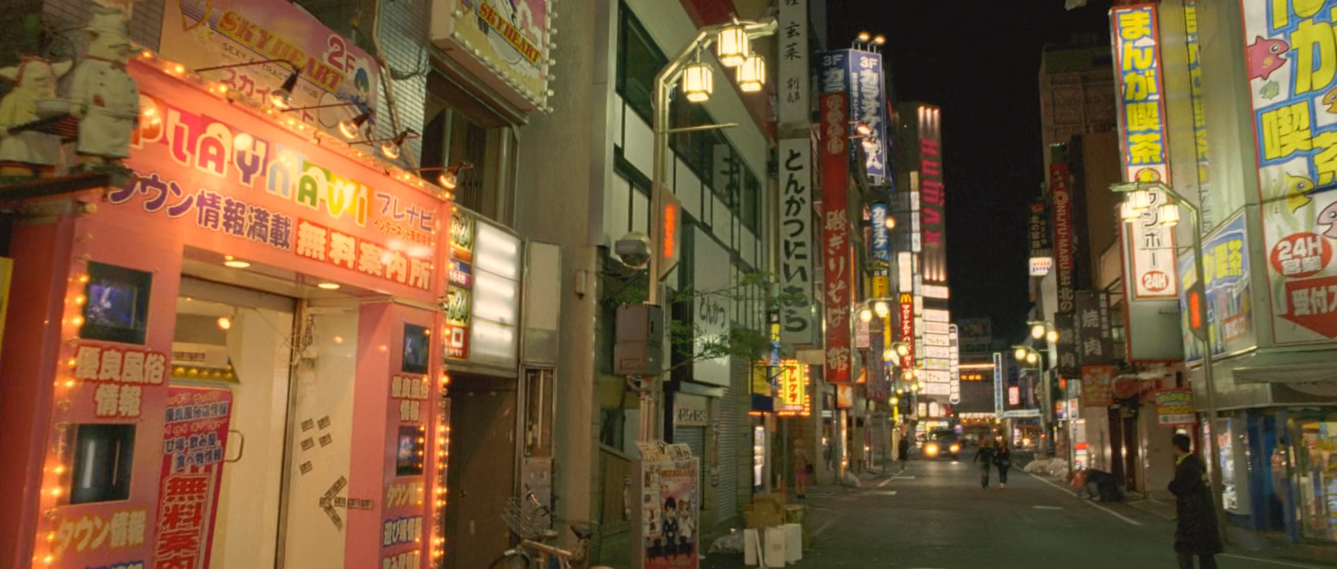
03 · The practical city · shot 826 · 01:18:42:17
Many signs, one readable street
Orange, yellow, white, red and blue signage climbs a narrow street, but neutral facades, dark pavement and depth falloff prevent the frame becoming a flat wall of colour.
Stacked signs provide several colour temperatures while the grey-green street and receding dark gaps preserve architecture and depth.
What is remarkable
This is the report's brightest and most spatially complex practical-light frame. More than a tenth of the pixels meet the configured highlight threshold, yet no single source erases the street. The left orange storefront, tall yellow signs, small cool panels and pale street lamps each keep a different relationship between core, coloured border and surrounding facade.
Despite the apparent variety, the measured frame leans strongly warm. Cool signs are small and the buildings remain subdued, so the eye reads one amber city punctuated by minor alternatives. The difficult part is not adding colour; it is preventing each practical from being normalized to the same brightness, saturation and sharpness.
Where the image comes from
Real signage, exposure timing, deep street perspective and locally reflected colour must be present in the photography or delivered as integrated plates. The camera exposure must hold the brightest panels while still allowing low-mid facade texture. A grade can prioritize signs, suppress unrelated colour, compress the top and add restrained optical spread, but it cannot recover legible lettering from clipped channels.
Use separate source families and large architectural windows rather than many tight sign-shaped masks. Build depth by progressively reducing background density and chroma, then use the final gamut pass to keep saturated edges inside delivery.
Waveform
RGB distribution
Vectorscope
Can regular footage get there?
Conditional
A practical-heavy night street can reach this look on ordinary log/raw footage when signage is exposed below channel clipping and the environment contains real mixed-source spill. Footage with blown panels and clean white ambient fill will not support the same layered density.
Minimum capture conditions
Controllable camera exposure or multiple plate exposures for the brightest signs.
Real facade and pavement detail in the lower mids, not a noise-floor rescue.
Lens and atmosphere that produce modest source spread without erasing sign geometry.
Composite and background read
Practical signage dominates the visible read
Perspective, reflections and source falloff are coherent across the street. Individual sign replacements, removals or stabilization are plausible, but the still does not expose a specific mismatch.
The midpoint cannot rule out extensive invisible cleanup or sign replacement; moving footage and production plates would be needed to raise confidence.
Shot-specific Resolve pass
Use the global tree, then make these decisions
E03
Keep a hierarchy inside the highlights
Compress specular values with a soft curve while allowing the left storefront and major vertical signs to remain brighter than minor panels.
Why: Relative source levels make the street three-dimensional.
Watch: Do not pull every sign down to the same grey-white plateau.
E06
Group rather than isolate
Build broad warm, yellow and cool-sign branches constrained by street regions; adjust density before chroma.
Why: Shared families are more stable than dozens of tiny encoded-image keys.
Watch: Keep neutral facade and lettering from inheriting the sign colour.
E07
Grade depth
Use broad perspective-aligned windows to make the distant street slightly darker and less chromatic while holding the foreground shop edge.
Why: Depth is read through controlled falloff as much as through geometry.
Watch: Static bands must follow the street perspective and camera movement.
E09
Give only hot sources air
Add low-gain source-specific bloom with separate thresholds for the hottest panels and smaller bulbs.
Why: Unequal spread preserves the practical hierarchy.
Watch: Lettering and facade edges must stay legible at normal viewing size.
Failure modes to check before approval
Individual RGB channel clipping hidden by a legal luma waveform.
Equalized sign brightness that flattens street depth.
Broad glow that fogs the entire street.
Hue keys crawling across small text and defocused pedestrians.
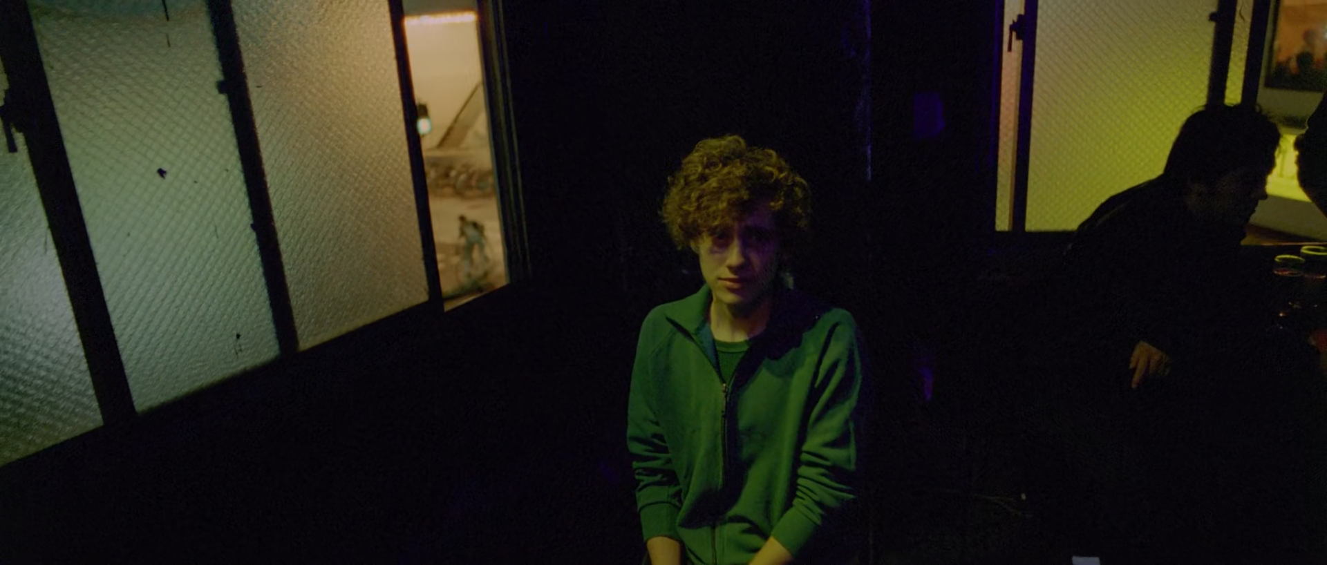
04 · A face inside green · shot 923 · 01:22:47:11
The jacket carries the colour; the face carries the scene
A seated young man in a green jacket is held between pale wired-glass panels and deep violet-black space, with a second figure reduced to silhouette at right.
The green jacket is the principal chromatic mass; a small face lift and pale glass panels keep the portrait readable inside extensive darkness.
What is remarkable
The frame uses costume as a controlled colour source. The green jacket is neither the brightest nor the largest plane, but it is the clearest saturated object against a background where almost two thirds of the image falls into deep shadow. The face sits at the boundary between green spill and warm skin, while the wired glass provides pale geometry without becoming clean white.
The second figure is allowed to remain almost entirely silhouetted. That asymmetry matters: a conventional lift for both people would remove the portrait's directional focus. The green must remain dense enough to anchor the centre without spilling electronically into every low value.
Where the image comes from
A genuinely green garment, local side/front light and controlled negative fill must exist on set. The pale glass and dark room provide the value structure. Grading can deepen the garment, limit its hue family, separate the face and suppress green noise in the shadows, but it cannot generate clean skin structure where the source was never exposed.
Use a costume branch and a separate face branch drawn from the pre-look image. Keep the silhouette on the right largely outside both operations. The result should feel as if one small pool of light found the central sitter, not as if post-production painted him brighter.
Waveform
RGB distribution
Vectorscope
Can regular footage get there?
Conditional
The relationship is achievable from regular log/raw material when the jacket is genuinely green and the face has sufficient exposure above the noise floor. Underexposed compressed footage will not tolerate the required face and shadow separation.
Minimum capture conditions
A saturated but non-clipped green garment under broad-spectrum light.
A soft local source on the face plus real negative fill around both figures.
Enough bit depth and exposure to shape the face without revealing fixed-pattern or chroma noise.
Composite and background read
The portrait reads as a coherent photographed interior
Glass texture, occlusion, shadow direction and green spill align naturally around both figures.
A still cannot exclude cleanup or invisible window work, but no visible cue requires a composite explanation.
Shot-specific Resolve pass
Use the global tree, then make these decisions
E03
Hold the asymmetric darkness
Set a soft toe that keeps the right figure near silhouette while retaining a small value step around the central sitter and glass.
Why: Selective visibility is the portrait's hierarchy.
Watch: Do not open both figures for equal readability.
E05
Recover only enough face
Combine a broad skin key with a tracked face window; lift the midtone slightly and reduce green bias without neutralizing the light.
Why: The face needs shape but must remain embedded in the environment.
Watch: Check curls, lips and the jacket collar for matte contamination.
E06
Densify the green jacket
Key the garment broadly, lower gamma a little and steer yellow-green variants toward one deep green family.
Why: Density makes the jacket chromatic without a global saturation spike.
Watch: Do not key the pale glass or face shadows.
E08
Clean the lowest colour noise
Taper saturation in the deepest values while preserving legitimate violet and green spill above them.
Why: The black field should feel coloured by the room, not by codec noise.
Watch: An aggressive taper will make the silhouette edges grey and detached.
Failure modes to check before approval
A face lifted into a different lighting world from the jacket.
Green qualifier chatter in hair and glass texture.
Shadow denoise that smears the second figure's edge.
Uniformly neutral blacks that remove the violet-green ambience.
05 · The warm memory · shot 2498 · 01:45:54:24
Daylight compressed into dust and skin
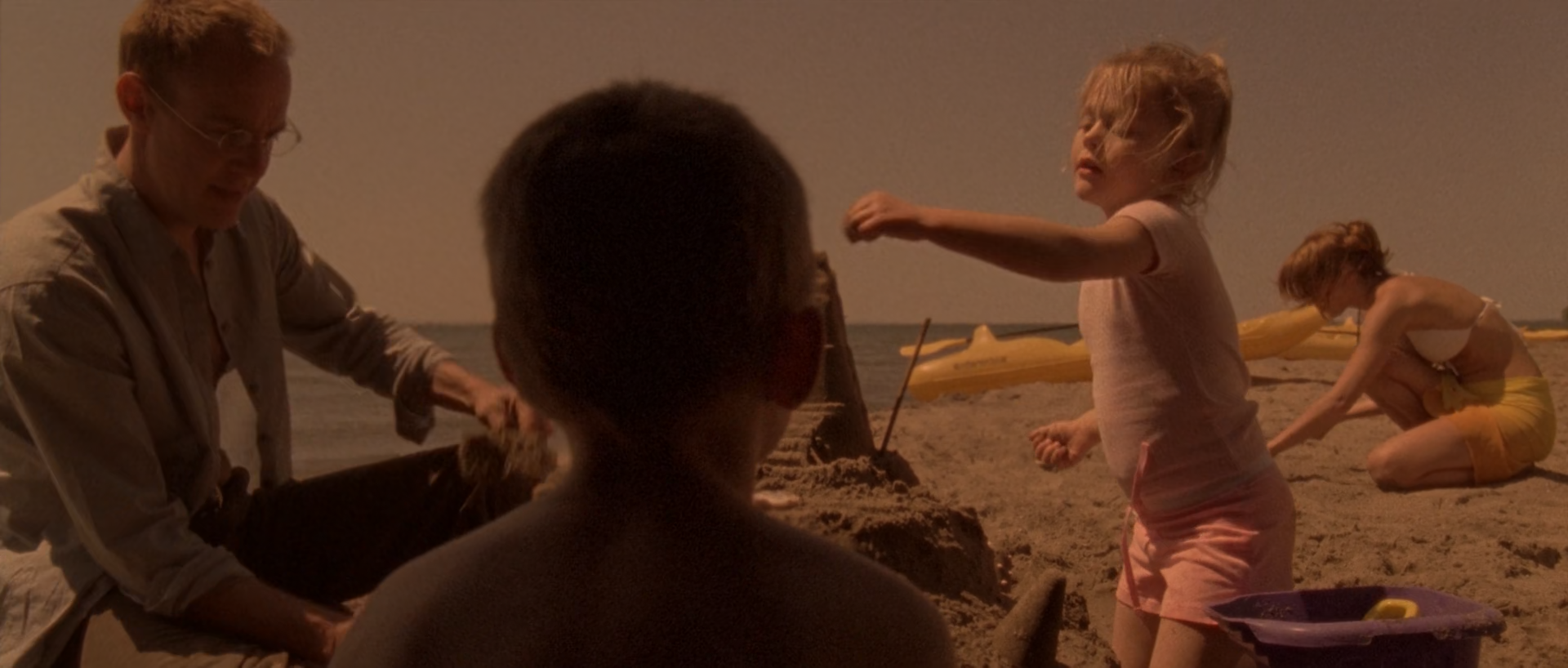
A family on a beach is viewed over a child's head, with sand, sky, clothing and skin all pulled into a narrow low-key brown-pink range rather than separated by normal daylight colour.
Skin, sand, clothing and sky share a muted brown-pink field, while silhouettes and small value differences keep the family separated.
What is remarkable
This image is daylight made psychologically dense without becoming a monochrome overlay. The beach, sky, clothes and skin are constrained to warm brown, pink and dusty orange, while the boy's dark head creates a near-black foreground anchor. Although the mean saturation metric is high, mean lightness remains only about 20 L* and no pixels meet the configured highlight threshold; the impression is coloured density rather than brightness.
The important separation is within warmth. The man's grey-brown clothing, the girl's pink outfit, skin and sand do not collapse to one sepia value. Their small hue and luminance differences carry the scene, and the pale horizon remains present without becoming a cool escape.
Where the image comes from
Back/side daylight, beach production colour, wardrobe and the over-shoulder viewpoint establish the picture. Exposure must protect skin and the pale horizon while permitting a dark foreground head. Grading can lower overall key, compress blues and greens, converge warm families and add density, but a flat midday source with clipped sky or weak subject separation will not behave the same way.
Build the contrast architecture before the colour subtraction. Use broad palette convergence with protected skin and pink costume, then locally keep faces and limbs from merging with the sand. The target is a restricted family, not a single brown wash.
Waveform
RGB distribution
Vectorscope
Can regular footage get there?
High
Correctly exposed daylight log/raw footage with compatible wardrobe and beach colour can reach this restricted warm palette through ordinary curves, colour warper and local protection. The look is demanding but does not require unusual capture technology.
Minimum capture conditions
Protected sky and skin channels with enough negative exposure latitude for a low-key finish.
Wardrobe and environment already clustered around beige, pink, brown and muted neutral families.
Real foreground/background separation in focus, blocking and exposure.
Composite and background read
The beach scene reads photographically
Occlusion, depth, edge softness and shared daylight direction are coherent across the family, sand and horizon.
The still cannot exclude cleanup or horizon work, but it offers no positive seam, grain or lighting cue.
Shot-specific Resolve pass
Use the global tree, then make these decisions
E03
Lower the daylight key
Use a pivoted curve to place skin and sand in the lower mids while retaining separation in the darkest head and pale horizon.
Why: The memory feels dense because ordinary daylight values are compressed downward.
Watch: Do not close the man's clothing and foreground head into identical black.
E04
Subtract the open-air palette
Reduce cyan/blue and green saturation, then make shallow rotations toward dusty brown-pink while pinning skin and the girl's costume.
Why: A restricted family creates the memory register without a global tint.
Watch: Large rotations will posterize the sky and make skin uniform.
E05
Preserve warm differences
Mix back a restrained pre-look branch for faces, limbs and the pink costume, adjusting density more than hue.
Why: Material and subject separation must survive inside the warm field.
Watch: Neutralized skin will appear pasted onto the sepia environment.
E11
Keep the image tactile
Use modest region-specific texture and fine finishing grain after any sky smoothing or noise reduction.
Why: Texture keeps the warm compression from feeling like a flat digital filter.
Watch: Do not sharpen the pale horizon into a cutout edge.
Failure modes to check before approval
One-dimensional sepia that erases pink, beige and skin differences.
Banding in the compressed sky.
Over-neutral skin that breaks the shared daylight field.
A raised foreground head that loses the over-shoulder anchor.
06 · Two narrow-spectrum worlds · shot 2592 · 01:50:03:12
Red skin survives beside a green room
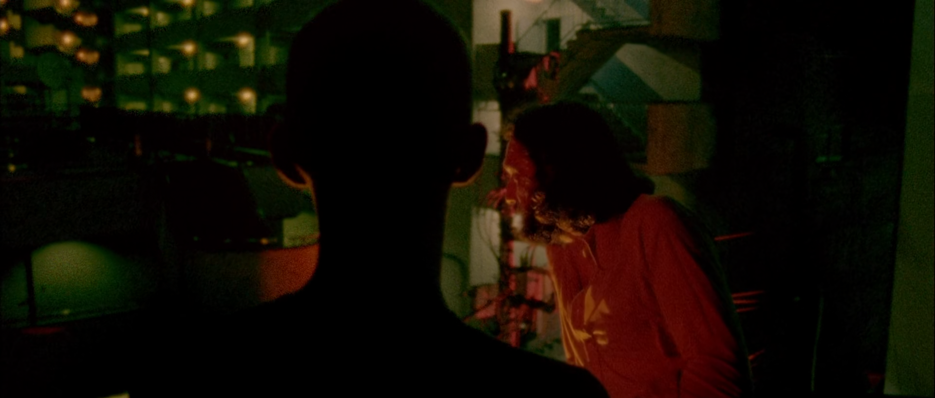
A black head silhouette divides a dim green background from a long-haired man struck by hard red light, leaving almost the entire frame below conventional exposure.
A central silhouette separates a green-lit background from the hard red figure at right; both colour fields emerge from extensive near-black.
What is remarkable
This is not simply a complementary palette. The red and green zones have different spatial jobs and exposure: green provides distant room structure, red models the nearer man's face and shirt, and the foreground head remains almost entirely black. More than ninety-five percent of the frame lies in the configured shadow zone, so the visible colour survives in extremely little signal.
The image also accepts impurity. Red light reaches orange-brown on skin and cloth; green falls from yellow-green to near-black. Preserving those internal gradients is more important than pushing the vectorscope farther toward two idealized colour targets.
Where the image comes from
The two coloured sources, their spatial separation, negative fill and usable exposure in the red-lit face must be captured. Narrow-spectrum fixtures may omit colour information that grading cannot restore. A colourist can deepen the fields, suppress crossover, protect the central silhouette and manage shadow saturation, but cannot synthesize credible red-lit skin from an underexposed neutral face.
Treat red and green as parallel environmental branches with spatial constraints, not opposing global curves. Use a face window inside the red branch only if the source contains texture. Keep black placement upstream so keys are built from the uncrushed signal.
Waveform
RGB distribution
Vectorscope
Can regular footage get there?
Low · useful reference
This is a useful target for source exposure and two-colour hierarchy, not a generally reproducible candidate from regular footage. With the wrong LED spectra or insufficient shadow exposure, the necessary skin and room information simply does not exist.
Minimum capture conditions
Broad-enough red and green sources tested against the camera's spectral response.
A deliberate negative-fill design plus exposure that retains red-lit facial texture above noise.
Log/raw capture with non-clipped colour channels and stable shadows for keys.
Composite and background read
A practical two-colour interior is plausible
The central silhouette, background windows and red-lit figure share coherent occlusion and light boundaries. The separated spaces could permit background work, but no decisive matte edge is visible.
Extreme darkness conceals edge and grain evidence, so the still cannot reliably exclude cleanup, replacement or a layered background.
Shot-specific Resolve pass
Use the global tree, then make these decisions
E02
Balance for information, not neutrality
Place exposure so the red-lit face and green room retain texture; avoid using temperature to cancel either motivated source.
Why: Both colour families must remain available before the creative split.
Watch: If either channel is clipped or buried, stop and reassess capture rather than forcing the grade.
E03
Protect the central black shape
Build a graduated toe that holds the foreground head near black while retaining minimal room and face structure around it.
Why: The silhouette is the boundary that makes two colour worlds legible.
Watch: Do not create a noisy lifted rim around the head.
E06
Split red and green spatially
Use broad spatial windows intersected with hue/luma keys for the red figure and green background; adjust density before chroma.
Why: Parallel branches preserve different exposure and saturation behaviour.
Watch: Cross-contamination at hair and shoulders must look like real spill, not a hard matte.
E08
Taper shadow chroma
Reduce saturation only at the noise floor while allowing coloured gradients immediately above it.
Why: The image needs coloured darkness without codec-like red and green crawl.
Watch: An over-broad taper will turn both fields grey at their edges.
Failure modes to check before approval
Missing skin colour information under narrow-spectrum red light.
Qualifier seams along the foreground silhouette.
Red or green chroma noise mistaken for desired spill.
A lifted toe that destroys the frame's dominant black area.
07 · A corridor made of bulbs · shot 3392 · 02:07:44:23
Rows of light turn descent into depth
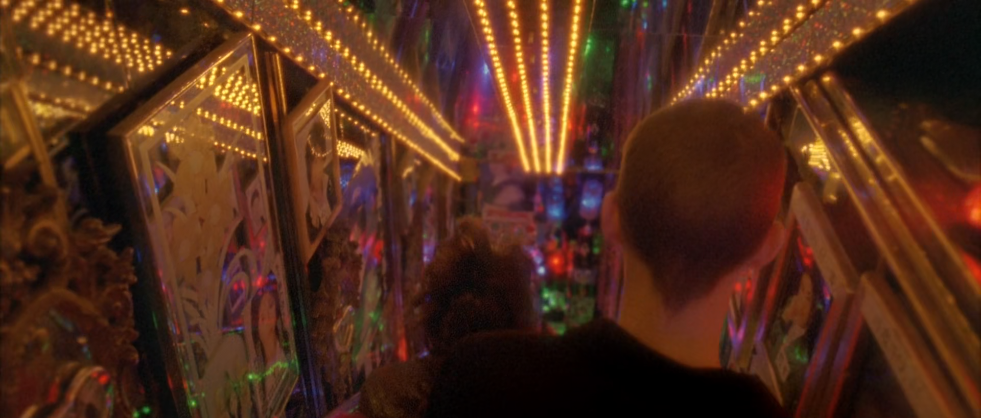
Two figures descend between mirrored, painted walls while converging bulb rows and small blue, red and green sources create a dense amber tunnel.
Warm bulb rows define the corridor's perspective; reflections and small cool colours complicate the amber field around two dark figures.
What is remarkable
The frame is highly chromatic and visually crowded, but geometry keeps it intelligible. Parallel rows of bulbs converge toward the centre, mirrored surfaces repeat them at lower contrast and the two dark heads interrupt the pattern. Amber dominates by both area and brightness while small red, blue and green marks keep the tunnel from becoming a uniform orange chamber.
The optical softness is selective. Bulbs bloom, painted panels remain legible and the nearest head edges stay comparatively solid. The measured highlight share is modest despite hundreds of visible bulbs, which confirms that apparent luminosity comes from contrast and repetition rather than a frame full of clipped white.
Where the image comes from
The corridor design, bulb spacing, mirrors, painted surfaces and practical exposure are the image. The lens and atmosphere need to create real reflection and spread. Grading can align the warm family, reduce off-palette clutter, manage bulb cores, deepen the figures and tune reflected colour, but it cannot invent converging light geometry or credible mirror duplication.
Build the corridor as an amber environmental branch, then isolate the small cool sources only enough to keep them present. Use perspective-aligned local shaping and source-specific bloom; avoid a global orange wash or global glow.
Waveform
RGB distribution
Vectorscope
Can regular footage get there?
Conditional
Regular log/raw footage can match the finish when the location already contains dense practical rows, reflective surfaces and compatible production colour. A plain corridor with a few lamps is not a viable starting point regardless of grade sophistication.
Minimum capture conditions
Practical bulbs exposed with recoverable cores and visible warm falloff.
Reflective and painted surfaces that repeat colour and perspective physically.
Enough dynamic range to keep both the central dark figures and the corridor depth separable.
Composite and background read
The visible corridor reads as a practical mirrored set
Converging reflections, bulb spacing, occlusion and defocus are coherent. Cleanup or extension is possible, but the still supplies no specific repeated-pattern or edge mismatch.
Only moving footage could reveal tracking, reflection-replacement or flicker inconsistencies concealed by this midpoint.
Shot-specific Resolve pass
Use the global tree, then make these decisions
E03
Keep bulb cores distinct
Use a soft shoulder that preserves small intensity differences among the bulb rows while keeping the figures dark.
Why: Repeated but unequal sources create the depth rhythm.
Watch: A broad highlight pull can make every bulb the same dull beige.
E04
Unify the amber field
Converge yellow, orange and red-orange surfaces gently, then reduce unrelated hues in the wall paintings without eliminating them.
Why: The corridor needs one dominant family with surviving small accents.
Watch: Do not turn skin, wood, bulbs and reflected paint into one flat orange.
E07
Follow the corridor perspective
Use large feathered windows aligned to the walls to hold near/far density and keep the central exit readable.
Why: Architectural shaping supports the existing convergence.
Watch: Track perspective changes manually; drifting windows will slide across the mirrors.
E09
Bloom the sources, not the tunnel
Key the brightest bulb cores and add restrained warm spread, with a smaller separate pass for coloured sources ahead.
Why: Local contamination makes the lights luminous while panels remain textured.
Watch: Global haze will erase mirror and painting detail.
Failure modes to check before approval
Clipped bulb channels creating hard yellow discs.
A global orange wash that removes material differences.
Perspective windows drifting across mirrored walls.
Glow swallowing the central figures and corridor exit.
08 · The city as a plane · shot 4698 · 02:48:09:23
An overhead city becomes yellow-green geometry
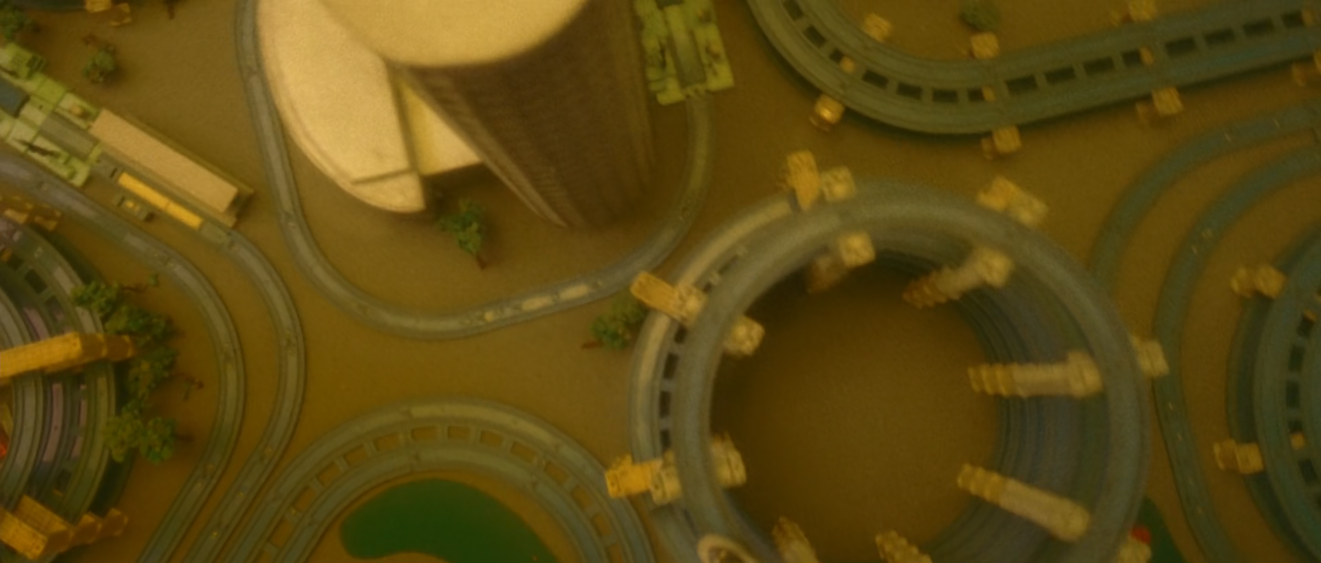
A vertical view turns curved elevated roads, rounded structures and tiny vehicles into a flattened pattern, with green-grey pavement and dirty yellow architecture sharing a low-contrast atmospheric veil.
Regular-footage feasibility: Low · useful referenceComposite/VFX read: medium
Curved roads and rounded structures form an overhead pattern; green-grey pavement and yellow architecture are unified by soft contrast and atmospheric contamination.
What is remarkable
Unlike the dark night frames, this image contains almost no deep shadow and distributes value through a compressed middle band. Its unusual strength comes from hue restriction: the measured palette clusters around olive, brown and ochre, with almost every classified chromatic pixel on the warm side. Small vehicles and trees remain visible through shape and slight value change rather than through independent colour.
The top-down viewpoint removes a normal horizon and turns the city into graphic geometry, but it remains a depictive architectural shot rather than an abstract effect field. Peripheral softness and low-contrast contamination reduce the clinical sharpness expected from a map-like view. That optical/environment layer is as important as the yellow-green grade.
Where the image comes from
The direct overhead access, city geometry, scale, atmospheric depth and any transition into or out of the view must come from camera design, plates, miniature/CG work or a combination. Grading can compress hues, steer the field toward ochre-green, soften contrast and integrate elements, but it cannot turn an ordinary oblique street shot into this spatial construction.
Treat every environment element in a common scene-referred space before the shared look. Match sharpness, haze, black level and motion blur first; then apply broad palette convergence and localized optical softness. Do not use the warm wash to conceal mismatched plates.
Waveform
RGB distribution
Vectorscope
Can regular footage get there?
Low · useful reference
The colour family is straightforward, but the image as a whole is not generally reproducible from regular footage because the vertical viewpoint, environment continuity and optical falloff are production/VFX conditions. Treat it as a reference for integration and palette, not a preset candidate.
Minimum capture conditions
A true top-down plate or a correctly constructed environment with matching perspective and scale.
Element-specific depth, blur and atmospheric information before the look is applied.
Sufficient scene-referred latitude to compress the palette without collapsing road, roof and foliage separation.
Composite and background read
Aerial plate or environment construction is plausibly part of the shot
The directly vertical viewpoint over a broad, geometrically complex city area is production-demanding, and the frame combines unusual peripheral softness with a uniformly integrated atmospheric layer. Those cues make plate stitching, stabilization or a constructed environment plausible, though none is decisive in a single frame.
This is a calibrated reconstruction inference, not a production credit. A specialized live aerial rig and optical treatment could also account for the visible image.
Shot-specific Resolve pass
Use the global tree, then make these decisions
E10
Integrate before stylizing
Match all plates or environment elements for scene exposure, perspective, lens distortion, sharpness, haze and motion blur with the creative look bypassed.
Why: The broad warm field cannot hide inconsistent scale or depth.
Watch: Inspect road edges, vehicles, trees and structure boundaries at 100% and in motion.
E03
Compress into the middle
Use a gentle toe and shoulder with restrained midtone contrast so roads, structures and vehicles remain in a narrow but legible range.
Why: The view reads as atmospheric geometry rather than crisp survey imagery.
Watch: Do not flatten small vehicles and curb lines out of existence.
E04
Converge ochre and green
Reduce blue/cyan variation and steer foliage, pavement and architecture toward related olive, ochre and brown families while pinning small neutral distinctions.
Why: Hue restriction unifies the complex city pattern.
Watch: A single yellow overlay will remove road-versus-building separation.
E09
Rebuild uneven softness
Apply low-opacity localized haze and peripheral softness only where the reference loses contrast, leaving central small geometry comparatively legible.
Why: Uneven contamination prevents the top-down view feeling clinically digital.
Watch: Do not confuse softening with defocus; check edge behaviour and movement before choosing the tool.
Failure modes to check before approval
Mismatched sharpness or motion blur between environment elements.
A uniform yellow-green wash that erases architectural materials.
Synthetic peripheral blur with a visible radial boundary.
Tiny vehicles or trees changing scale, grain or contrast across a transition.